Your Primary Masthead looks to be disabled:
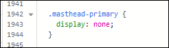
The logo is appearing because you’ve added it to the .page__pallet__top div in phplugins.
I’m not sure yet why it’s 96px tall. Maybe the extra <li> item can’t fit in the space allotted.
Your Primary Masthead looks to be disabled:
The logo is appearing because you’ve added it to the .page__pallet__top div in phplugins.
I’m not sure yet why it’s 96px tall. Maybe the extra <li> item can’t fit in the space allotted.
try removing the .top-pallet-title list item from your html. It only contains an anchor element. The same anchor element is already in your .top-pallet-logo list itiem
If I remove the .top-pallet-title from the php, the top pallet reverts back to 48px, as it should but the title disappears.
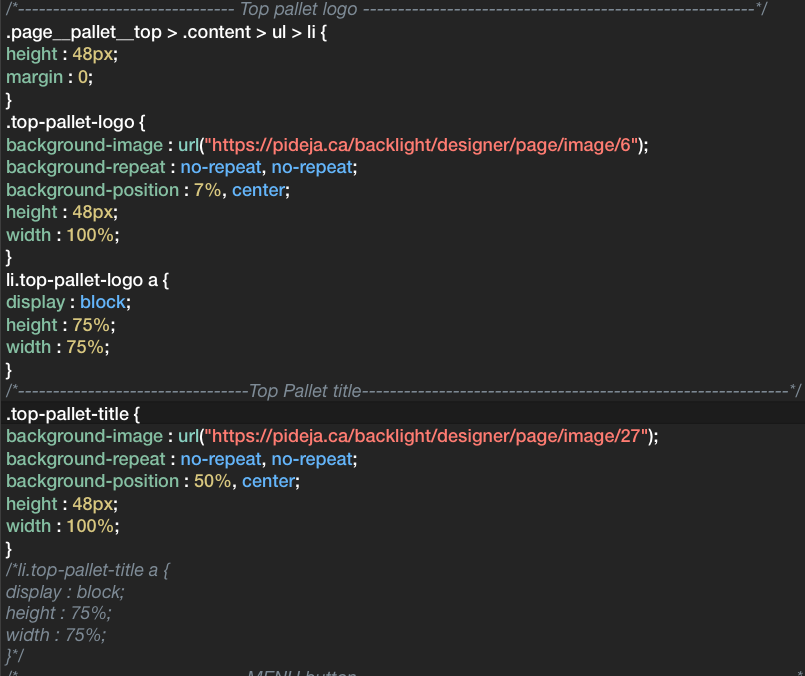
This is the CSS:
Now you just have the .top-pallet-title list item with only one image added as a background-image.
When you were also using .top-pallet.logo, you had two background images: one was the logo image and the other was the title image.
looking at the inspector, you no longer have the .top-pallet-logo list item in your html.
I changed the way the PHP is written, for the top pallet section. It seems to make a difference. The pallet is back at 48px but now I have a title but no logo.
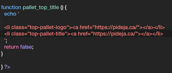
    /* Display the title in pallet_top */

function pallet_top_title () {
  echo '

  <li class="top-pallet-title"><a href="https://pideja.ca/"></a></li>    ';

  return false;
}
/* Display the logo in pallet_top */

function pallet_top_logo () {
  echo '

  <li class="top-pallet-logo"><a href="https://pideja.ca/"></a></li>   ';

  return false;
}

} ?>
@Pideja I’ve editing your posts with code, but FYI, you can use markdown syntax here to set up code blocks with syntax highlighting.
Open a block using three back-ticks, and close it with three more. You can also specify the language for highlighting. For example:
'''css
  .selector {
    property: value;
  }
'''
I’m using apostrophes here so that you can see it, but change those to back-ticks, and you’ll get formatting.
Pierre,
you can’t repeat hooks in phplugins. You can only use the pallet_top_title hook once and you need to put all your code into that.
Hello Matthew,
I found the back-ticks on my French keyboard. Will now use it when pasting code.
Thank you.
So, I commented out the .top-pallet-title in the CSS and added the reference to the title image in the .top-pallet-logo section.
In the PHP, I reverted to the original code with only one reference to "top-pallet-logo"
I am now back to where I started…except that now, the logo, the title and the menu button behave as they should on the large monitor and even when shrinking the viewport, to some extent. The PHP:
/* Display the logo in pallet_top */

function pallet_top_title () {
  echo '

  <li class="top-pallet-logo"><a href="https://pideja.ca/"></a></li>

  ';
  return false;
}
```
and the CSS:

```
/*------------------------------- Top pallet logo --------------------------------------------------------*/
.page__pallet__top > .content > ul > li {
height : 48px;
margin : 0;
}
.top-pallet-logo {
background-image : url("https://pideja.ca/backlight/designer/page/image/6"),url("https://pideja.ca/backlight/designer/page/image/27");
background-repeat : no-repeat, no-repeat;
background-position : 7%, center;
height : 48px;
width : 100%;
}
li.top-pallet-logo a {
display: block;
height : 75%;
width : 75%;
}
/*----------------------------------MENU button position-------------------------------------------------------*/
.page__toggle__buttons label {
content : 'Menu';
background : #9F191E;
display : inline;
position : absolute;
right : 7%;
top : 0px;
}
/*-----------------------------------MENU button no apparent use -----------------------------------------------*/
.page__toggle__buttons label {
margin-right : 1px;
overflow : hidden;
background-color : #9F191E;
}
/*------------------------------------MENU label text-----------------------------------------------------------*/
.page__toggle__buttons label p {
cursor : pointer;
display : block;
font-size : 1rem;
font-weight : 500;
height : 48px;
line-height : 2.7em;
min-width : 48px;
position : absolute;
top : 5px;
left : 1px;
text-align : center;
}
```
I guess that for now I'll work with this, until I understand better the relationships between Backlight, CSS and PHP.

Thanks again for your help.Looks good now. And even if it’s not quite perfect, I think I’d leave it as is.
I guess your right. I should go to the task at hand: populating this image-data-base I’ve been building for a couple of years now. Hoping to complete by the end of 2022! Then, and only then will I revue the site’s look and format.
Thanks for your patience.
Ah, a pandemic to-do list!
Indeed and at 72, it’s also a “while-I-still-have-time” list!
Well, I couldn’t help it: in order to correct the display on the mobile, I fiddle around with the media queries and I succeeded in fixing the mobile display. I had received a warning from Google that there were problems with the thumbnail displays on the mobile.
However, in the large display, I now have lost the MENU button. Strange since I did not change a thing other than what pertained to the mobile display.
In BACKLIGHT, I have the Primary Masthead Location: disabled / Visibility: desktop.
Note that when I indicate Location: in the header, I get a second title on a pale grey tripe.
No change in the CSS.
Any clues?
.page__toggle__buttons label {
content : 'Menu';
background : #9F191E;
display : inline;
position : absolute;
right : 7%;
top : 0px;
}
/*-----------------------------------MENU button no apparent use -----------------------------------------------*/
/*.page__toggle__buttons label {
margin-right : 1px;
overflow : hidden;
background-color : #9F191E;
}*/
/*------------------------------------MENU label text-----------------------------------------------------------*/
.page__toggle__buttons label p {
cursor : pointer;
display : block;
font-size : 1rem;
font-weight : 500;
height : 48px;
line-height : 2.7em;
min-width : 48px;
position : absolute;
top : 5px;
left : 1px;
text-align : center;
}
/*--------------------------------------------------------------------------------------------------------------*/
.page__toggle__buttons label {
margin-right : 1px;
overflow : hidden;
background-color : #9F191E;
}
.page__toggle__buttons label a {
color : #FFF;
text-decoration : none;
font-size : 17px;
display : block;
padding : 14px 16px;
}
.page__toggle__buttons label a:hover {
background-color : #ddd;
color : #000;
}
.active {
background-color : #4CAF50;
color : #FFF;
}
/*--------------------------------------------------------------------------------------------------------------*/``the menu button shows up at smaller mobile sizes. check the break point in the template’s layout settings. It looks like it’s set at 640px. You need to have it set at “Always”
That second “title” should be the tagline. But since you’ve got the masthead disabled, the tagline doesn’t matter.
I changed the breakpoint in LAYOUT / BREAKPOINT to 1920px. That is my maximum viewport size. But there is the line" The width at which the page falls into mobile layout."
Won’t setting it at 1920px interfere with the mobile display? Unless…of course: @mediaqueries. It works fine, now.
By the way, this is the message I received that started this…
Ergonomie mobile issues detected on https://pideja.ca/
To the owner of https://pideja.ca/:
Search Console has identified that your site is affected by 2 Ergonomie mobile issues:
Top Issues
The following issues were found on your site:
Content larger than screen
Cliquable elements too close together
We recommend that you fix these issues when possible to enable the best experience and coverage in Google Search.
The mobile layout, among other things, sets the point where horizontal navigation disappears and the menu button appears.
For yours, if you’re not using horizontal navigation at all, then the break point should be set to Always. If someone is viewing your site on a large monitor in a browser wider than 1920 px then the Menu button won’t appear.
Unless you can point to pages and elements on the page causing issue, I have nothing to say about those issues. Make sure you’re running the latest versions of things. No such reports on my own site.
Sorry, I didn’t get back to you…it’s been a while! So much so that I can’t recall the original issue and the site looks good, as far as I can see.
Thank you.