Hi,
I have just finished the partial migration of my website. Is it worth it? Yes, loading is undoubtedly faster, navigation improved, and many other things. But this required to re-configured everything and republish all images, which requires a lot of work.
There remain two unresolved issues:
1°) The vertical navigation of albums under Pangolin is on the left, and on the right under Kookaburra. Is there a way to harmonize the two presentations?
2°) I renamed the top-gallery so that the database has two addresses for it The new one John Bronces - Galeries
and the older one John Bronces - Séries
The old one is not accessible in the top-level set panel of BL . Is there a tool to clean the databases?
Thank’s for your help.
There is no navigation on your site at desktop sizes. If I shrink the browser down to mobile size, I see the mobile menu icon on the left.
So I can’t really see what you’re describing regarding the dual vertical navigation. Can you include a screen capture?
What to you mean by harmonizing the two presentations?
To your second question. You could try the Update Album Files link on your Backlight Special Links page.
If that doesn’t work then @Ben would need to take a look.
Hi Ben, Concerning the problem of the defective link, probably, I had modified the identity of the Top Galerie Template in Edit Template. Could you tell me, which file to modify the code? Thanks in advance .
Second problem has been solved. Thank’s.
Please, do you think that’s possible to choose to place the vertical navigation at the left or at the right ? Thank’s
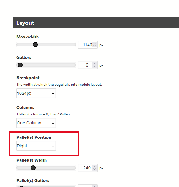
It looks like all your pages, other than albums, are using Pangolin templates. For Pangolin, in your page template, go to Layout:
I don’t yet see a way to move the vertical navigation in Kookaburra.
Also, there is no navigation at desktop sizes (wider than about 1440px) for any of your Pangolin pages.
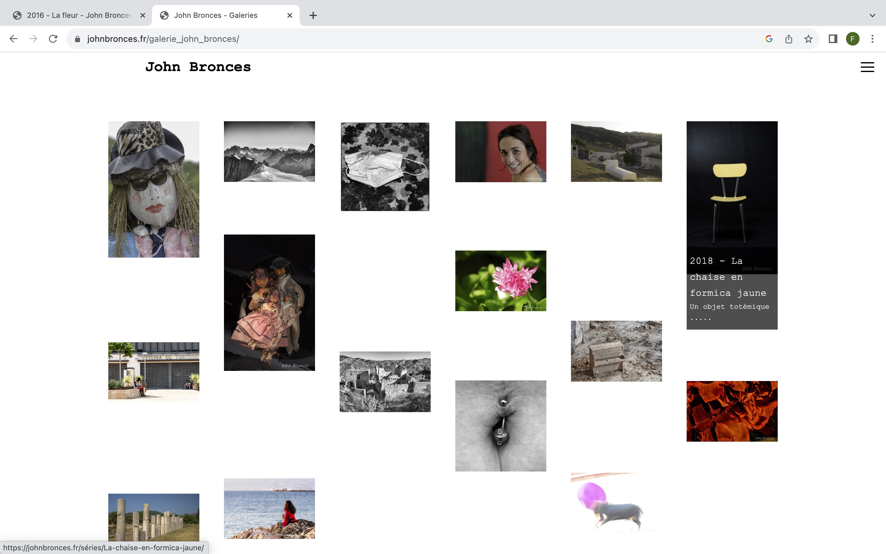
Hi Rod, Yes it’s work. Thank’s a lot. However, some albums used Kokakaburra templates, as I wrotte. It’s seems that the navigation is always at the right. Nevertheless I am happy and many thak’s for the support. John
Take a look at your site on a desktop computer, there is no navigation on desktop display sizes (other than in your Kookaburra albums)
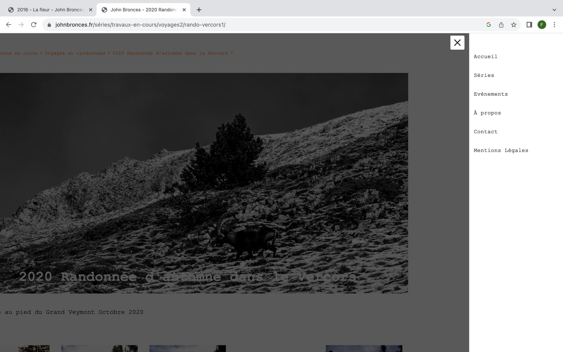
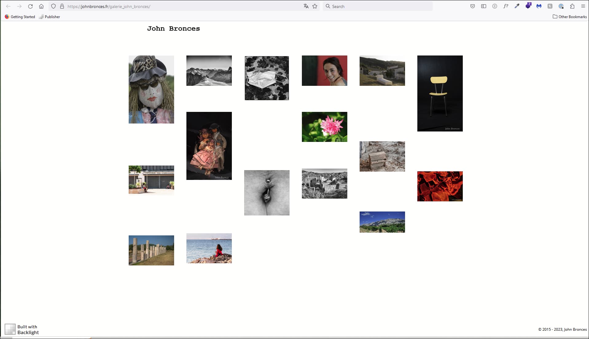
I d’nt understand where is the problem. Would you send me a screenshot ? Here enclosed mine.
I’m not seeing the mobile menu icon in the upper right on any of your Pangolin pages.
What device are you using to look at your site? How big is the monitor? I’m looking on monitors that are 1600 px wide and 1920px wide.
When I shrink the browser window down to about 1140px wide, then I see the mobile menu icon.
If you want that icon to appear at any browser size, you need to set the Breakpoint to “Always”
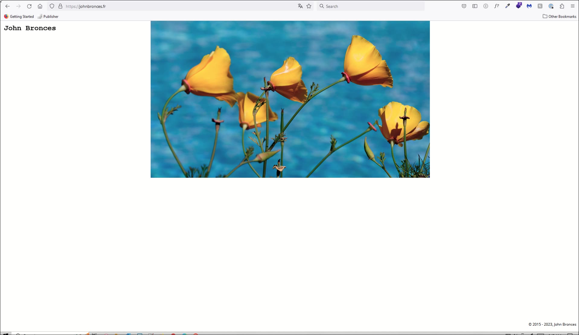
Your home page:
your Galleries page:
Great ! Many thank’s for this . Have a good day !