Pideja
March 21, 2023, 7:29pm
#1
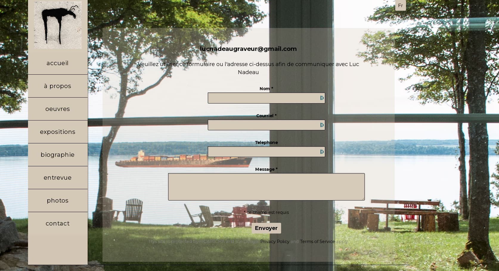
Having a hard time aligning the elements on this page: https://pideja.ca/lucnadeau/client-response/
 /* Contact Form */
.contact-form p {
text-align : center;
margin-left: 120px;
}
.contact-form input {
max-width : 50%;
margin : 0 auto;
}
.contact-form input {
/*max-width:150%;*/
background-color: #d1c7b3;
color: black;
font-weight: 600;
}

/*.slug-contact input#name,
.slug-contact input#email,
.slug-contact input#field_1,
.slug-contact textarea#field_3 {
    background: transparent;
}*/

#message {
    margin: 1.5rem auto;
    border: 0;
}

#message.success {
    background-color: rgb(213, 202, 184);
    color: #000000;
}

#message.error {
    background-color: rgb(213, 202, 184;
            color : #000000;
    }
As you can see I’m kinda fumbling around, although I’m almost there. Looking to get to something like:
But it still needs some adjusting. Any hints?
the page looks just like what you posted. What do you want to change?
that margin-left:120px; is likely to mess things up on mobile.
Pideja
March 21, 2023, 7:47pm
#3
I know but it’s the only I found to align the SEND button and the MASSAGE box. I don’t lke it but until I find a way…
use rgba color code in custom css for background-color
W3Schools offers free online tutorials, references and exercises in all the major languages of the web. Covering popular subjects like HTML, CSS, JavaScript, Python, SQL, Java, and many, many more.
Daniel
March 21, 2023, 9:21pm
#5
I have difficulties to read the text with your transparency settings:
As Rod mentioned, the alignment doesn’t work well on a small screen.
Daniel
March 21, 2023, 9:32pm
#6
Instead of .contact-form p { margin-left: 120px; }, you might want to use
.contact-form input, .contact-form textarea {
    margin-left: auto;
    margin-right: auto;
}
I agree Daniel,