I want the rough proportion of the space on either side of the grid to the grid itself to be about what you see in the image. And I want the images very close to each other. Each image will be linked to a gallery.
I’d use the Responsive Grid feature built in to Backlight but, since it limits you to a 12 column grid and I have an odd number of columns (3 image, 2 borders), I can’t see how to group the columns to get close to the proportions I’m after.
Any suggestions as to an approach?
Can I just write my own HTML/CSS grid for this page, something with a different number of columns - such as 15 total, 3 for each image column and 2 for left of grid and 2 for right of grid?
I’m not sure I understand. I mean, the space on either side of the grid is going to be fully dependent upon the width of the visitor’s browser window, which varies wildly, depending on device, desktop organization, etc.
I completely understand your confusion and realize I either may not be articulating it properly or don’t understand something fundamental. I think this is why I referenced “proportions”.
I am little unclear how the grid function actually works (I assume the builtin responsive grid in Backlight is based on the standard CSS Grid feature). It breaks something up into x number of equally sized columns. Is it a specific number of pixels or the size of the browser window at any moment, or ??? I’ve always wondered if there is a parameter in Backlight where I specify the number of pixels in the width of a page. Is that “max-width” in the Layout portion of a template design?
Maybe the accurate way to state my requirement is to compare the relative size of the grid (width) to that of the navigation menu above it as I assume these things stay relative to each other regardless of browser window size (until you enter the responsive world).
As the browser window increases in size, the borders on the side get bigger relative to the image grid. And I suppose at some point as the browser window gets smaller it reaches a point where it reaches a proportionally "accurate’ rendering of the, for example, 12 columns of the css grid. So if I made the borders left and right of the image grid 1 column wide, at some point the size of the browser window will have 1/12th of the width of that window showing up as empty border on each side of the image grid.
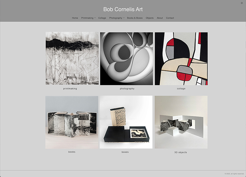
I’m sorry for not being more clear about this. But what I want is for the image grid to extend beyond the width of the navigation bar above as in my mockup image. The nav bar is about 60% as wide as the width of the image grid. I understand I can’t really control the proportion of the borders on the browser window edges to the image grid. But I’d like to control the relationship of the image grid to the nav bar and the spacing between the images in the grid as well.
My concern is that the images will then be too large relative to the nav bar above. I want to be able to control that relationship for purely aesthetic reasons and it’s not clear how I could do that as well as maintain a specific distance between the 3 columns of the image grid (ie very little space in between as in my mockup).
Am I missing something that would enable that kind of control?
You can use more styling, like adding padding or margin.
you can limit the width of the overall content area (no need to use columns on either side just to contain the width).
@bobcornelis Actually, the album grid is NOT using CSS Grid. The grid is based on the content width that you provide in Layout options, with cells then being a percentage of that width. At breakpoints, defined using CSS @media rules for the screen’s max-width, those percentages are updated, again according to rules you’ve defined in the designer. So the factors are screen width and breakpoints, in which columns are a percentage of your layout width.
Pretty simple. Largely because Pangolin was put together before CSS Grid was widely supported.
Kookaburra is mostly the same, because I just don’t think CSS Grid is necessary for the way that we’re defined the album behavior.