CRG layout in mobile

I’m struggling with a few CSS tweaks to my (CRG) proofing galleries. Any advice for these related requests?

  1. Clients are asking for the ability to “tap on the IMAGE FEEDBACK button in thumbnail grid” but those buttons are hidden at <640px screens.

  2. Clients also want the ability to “tap on the SELECT IMAGE button in thumbnail grid” but those buttons are hidden at <640px screens.

  3. Clients also noticed that the “X to close slideshow” button and “SELECT IMAGE” button overlap one another (see attached screenshots) but only if there is no red/blue etc flag icon on the image. If there is a flag, the buttons do not overlap.

  4. I’d love to completely hide the “Image/Share menu (I)” button from the slideshow; I’m already hiding the individual social icons but showing the Share menu button itself is just confusing clients and cluttering the slideshow action-bar buttons.

  5. I’d also love to completely hide the “Thumbnails (G)” button from the slideshow; a column of all images next to slideshow-view is just confusing clients and cluttering the slideshow action-bar buttons.


For (#5) I should mention I’ve already tried using Rod’s sraightforward suggestion (from 2018) but it doesn’t seem to work:

.fancybox-button--pallet {

display:none;

}

1 & 2. You’ll need to use a custom stylesheet to override the CSS that hides the UI. This will probably do it.

@media only screen and (max-width: 640px)
  .grid-button {
    display: block !important;
  }
}

3, 4 & 5. In your template settings, under Photo Presentation, turn OFF “Thumbnails Pallet” and “Social Media Sharing”.

Thanks Matt. I appreciate it.

Was already using that CSS override; no change.

Here’s the relevant CSS for my CRG layout… maybe there’s a conflict in it that I’m not seeing?

@font-face {
  font-family: "Oswald";
  font-style: normal;
  src: local("Oswald-VariableFont_wght"),
       url("../webfonts/Oswald-VariableFont_wght.ttf") format("truetype");
}

@font-face {
  font-family: "RobotoCondensed";
  font-style: normal;
  src: local("RobotoCondensed-VariableFont_wght"),
       url("../webfonts/RobotoCondensed-VariableFont_wght.ttf") format("truetype");
}

html .font-oswald {
  font-family: "Oswald", sans-serif;
}

html .font-robotocondensed {
  font-family: "RobotoCondensed", sans-serif;
}

.the__gallery button.crg-help {
  display: none;
}

#crg-widget::before {
  content: "";
  font-family: "RobotoCondensed";
  font-size: 1.3rem;
}

li#crg-widget {
  width: 30px;
  font-size: 1.3rem;
}

li.crg-view {
  font-size: 1.3rem !important;
  text-align: center;
}

button.crg-help-widget,
button.submit,
p.modal-title {
  font-family: "Oswald";
  font-size: 1rem;
}

button.submit {
  color: #ffff00;
}

p.modal-title {
  line-height: 2rem;
}

.crg-metadata {
  font-family: inherit;
  margin: 2em 0;
}

.crg-options {
  font-family: inherit;
  font-size: 1.1rem !important;
  margin: 3em 0;
}

.crg-options label {
  font-family: inherit;
  font-size: 1rem !important;
}

.modal-actions button {
  font-family: inherit;
  font-size: 1.6rem;
}

button.discreet {
  font-family: inherit;
  font-size: 1.4rem;
}

form label,
.form label {
  font-family: "Oswald";
  font-size: 1rem;
}

.fancybox-caption__body,
.copyright {
  font-family: "RobotoCondensed";
  font-size: 1rem;
}

.fancybox-caption__body {
  color: #5c5c5c;
}

.copyright {
  color: #aaaaaa !important;
}

@media screen and (max-width: 640px) {
  .page__pallet__bottom,
  .page__pallet__bottom > .content ul {
    height: auto;
    min-height: 90px;
  }

  .grid-button {
    display: block !important;
  }
}

Thumbnails Pallet is off; success!

Social Media Sharing has been off for years now; no change. Is there a way to (entirely) remove the Social Media Sharing icon? Turning it off seems to remove any social media icons but not the parent button… and so the close/choose-icon-overlap continues:


Here’s a test page for demonstrating the problem

This seems to work:

.fancybox-button--pallet {
  display:none;
}

If it affects other things you need, then try making it more specific, like:

.fancybox-toolbar .fancybox-button--pallet {
  display:none;
}
1 Like

That CSS snippet came in clutch, Rod. Thanks again! That takes care of 3, 4, and 5.

Can I also hide the “magnify” and “full screen” buttons in a similar way? My goal is to keep all the slideshow toolbar buttons as simplified as possible for them to navigate without much of an implied learning-curve.

I’ve been using the browser inspector to try and figure out how to scoot over the filter/submit buttons to the left more, but I can’t seem to get any CSS changes to properly stick. In case you aren’t seeing what I’m talking about:

Lastly, where do I find the padding parameters for the IMAGE FEEDBACK pop-up dialogue window? I’ve noticed that the cancel/save buttons are overlapping each other and that the window is needlessly “skinny” on <640pixel screens:

fancybox-button--zoom and fancybox-button--fsenter are the classes you need to address for magnify and full screen:

.fancybox-toolbar .fancybox-button--pallet,
.fancybox-toolbar .fancybox-button--zoom,
.fancybox-toolbar .fancybox-button--fsenter {
  display:none;
}

I only see the misalignment when I zoom way in. On my iPhone, I don’t see it. The reason is that the buttons are wider than the visible area. Following addresses this a bit, but now the buttons are generally smaller. You could address this by only applying it to small display sizes.

.crg-actions-bar li {
   min-width : 32px;
}

.crg-actions-bar button {
   min-width : 32px;
}

#3: This might do the trick:

.modal-actions .save {
   width: 50%;
}

Hi Daniel! Really appreciate your input on this.

I see what you’re suggesting and it makes sense but so far I’m only getting the social media sharing button to hide. I’ve tried separating the CSS overrides out:

.fancybox-toolbar .fancybox-button--pallet {
  display:none;
}

.fancybox-toolbar .fancybox-button--zoom {
  display:none;
}

.fancybox-toolbar .fancybox-button--fsenter {
  display:none;
}

And forcing !important; into them as well but only the social media sharing button seems to follow the overrides… am I missing something?

I see, specificity is the issue:

.pangolin-album .fancybox-toolbar .fancybox-button--zoom {
    display: none;
}

Wild; I’ve cleared template cache in BL5, cleared browser caches (testing in both FF and Chrome through responsive design mode (iphone 12/13 mini) and on a physical Android phone (FF and Chrome browsers) and the only CSS change I can get to work is Rod’s initial suggestion for the social media share button hide:

.fancybox-toolbar .fancybox-button--pallet {
  display:none;
}

I’ve adjusted the width on your Save button adjustment from 50-10% but the changes barely make a difference (cancel is mostly hidden by a massive Save button).

I’m going to move on past the “scoot buttons left more” because you’re right in that it only seems to occur in FF browser on Android; no biggie.

But I’d really like to wrap this up and get the --fsenter and --zoom buttons to hide. As you suggested, I added the pangolin-album specificity, but still seeing no change. Anything else I could look into in order to get those overrides to stick?

Strange, it worked in my debugger, but not anymore… :frowning:

But I see that there’s an inline style.

.pangolin-album .fancybox-toolbar .fancybox-button--zoom {
    display: none !important;
}

Weird! Probably caching?

But yeah I also got it all to work (and apparently keep working lol).

The resulting proofing.css file is now:

@font-face {
  font-family: "Oswald";
  font-style: normal;
  src: local("Oswald-VariableFont_wght"),
       url("../webfonts/Oswald-VariableFont_wght.ttf") format("truetype");
}
@font-face {
  font-family: "RobotoCondensed";
  font-style: normal;
  src: local("RobotoCondensed-VariableFont_wght"),
       url("../webfonts/RobotoCondensed-VariableFont_wght.ttf") format("truetype");
}

html .font-oswald { font-family: "Oswald", sans-serif; }
html .font-robotocondensed { font-family: "RobotoCondensed", sans-serif; }

.the__gallery button.crg-help,
.pangolin-album .fancybox-toolbar .fancybox-button--pallet,
.pangolin-album .fancybox-toolbar .fancybox-button--zoom,
.pangolin-album .fancybox-toolbar .fancybox-button--fsenter {
  display: none !important;
}

#crg-widget::before {
  content: "";
  font-family: "RobotoCondensed";
  font-size: 1.3rem;
}

li#crg-widget,
li.crg-view { font-size: 1.3rem !important; }
li.crg-view { text-align: center; }

button.crg-help-widget,
button.submit,
p.modal-title,
form label,
.form label { font-family: "Oswald"; }

button.submit { color: #ff0; font-size: 1rem; }
p.modal-title { font-size: 1rem; line-height: 2rem; }

.crg-metadata,
.crg-options,
.crg-options label,
.modal-actions button,
button.discreet {
  font-family: inherit;
}

.crg-metadata { margin: 2em 0; }
.crg-options { margin: 3em 0; font-size: 1.1rem !important; }
.crg-options label { font-size: 1rem !important; }
.modal-actions button { font-size: 1.6rem; }
button.discreet { font-size: 1.4rem; }
form label,
.form label { font-size: 1rem; }

.fancybox-caption__body,
.copyright {
  font-family: "RobotoCondensed";
  font-size: 1rem;
}
.fancybox-caption__body { color: #5c5c5c; }
.copyright { color: #aaa !important; }

@media (max-width: 640px) {
  .page__pallet__bottom,
  .page__pallet__bottom > .content ul {
    height: auto;
    min-height: 90px;
  }
  .grid-button { display: block !important; }
}

.modal-actions .save,
.modal-actions .submit {
  float: right !important;
  width: 40% !important;
}

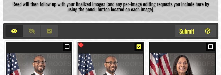
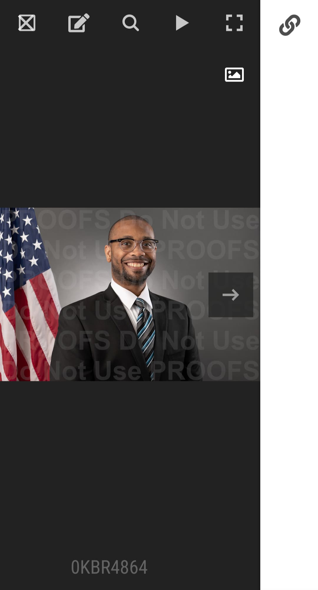
While “slightly-minifying” these resulting CSS overrides, I noticed a weird anomaly in responsive view:

Using the desktop version, the Submit button is simply the word “Submit” as a button.

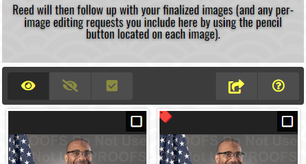
Using responsive view, the Submit button is an icon of an arrow curving outward from a square:

image

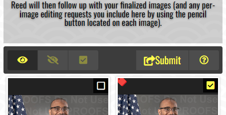
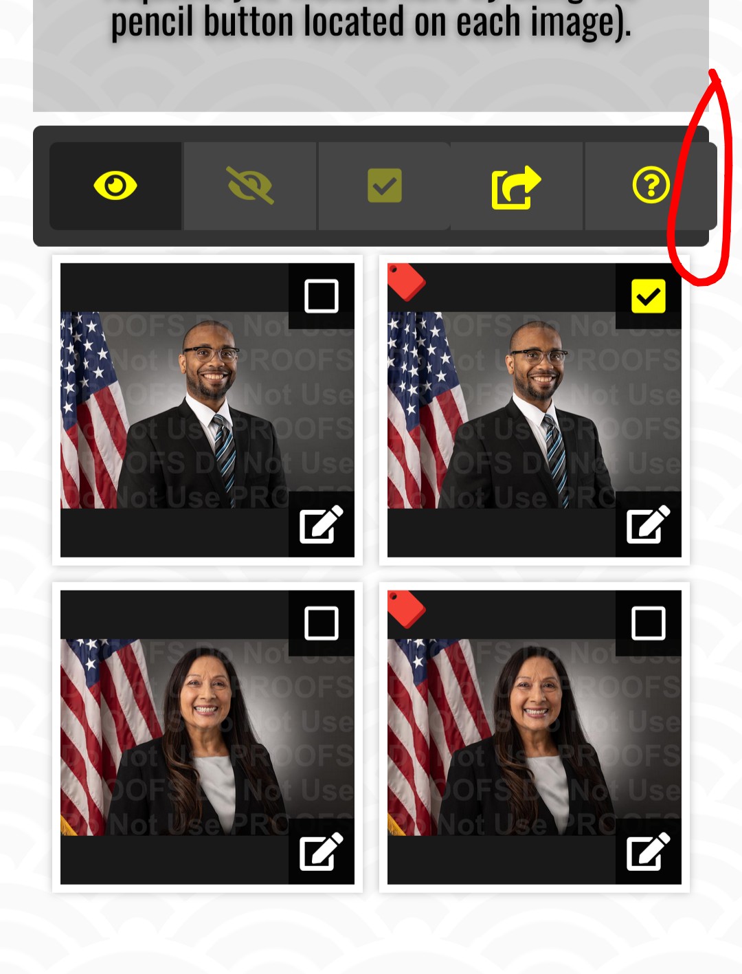
But if I “select an image” and then click the submit button and then back out of the submission form that same Submit icon is now both the word “Submit” again AND the arrow/box icon:

image

Can I simplify this layout for my clients and always force the word “Submit” AND the arrow/box icon via CSS override? I think that button-consistency would help them know exactly which button symbolizes “Submit” when reviewing proofs on their mobile phones.

This is what hides the submit text for small displays:

@media screen and (max-width: 614px) {
    .crg-submit button span {
        display: none;
    }
}

And this is what adds the pictogram:

@media screen and (max-width: 614px) {
    .crg-submit button::before {
        content: "\f14d";
        font-size: 1rem;
    }
}

So maybe something like this might work:

@media screen and (max-width: 614px) {
    .crg-submit button span {
        display: inline-block;
    }    
   .crg-submit button::before {
      display: none;
   }
}

It might need some additional specificity or an !important overwrite. Maybe without @media would be better.

Thanks again, Daniel. Looking much better now!

1 Like

Cool!

Looking at your screenshots, I have to wonder, do you have your font-sizes jacked up in the browser?

Indeed; not only am I getting older and losing visual fidelity (I’m sure you understand) but I’m also trying to emulate my older demographics’ common setting adjustment for “larger font sizes” (in the physical FF/android test browser) to better see what conflicts they might be seeing when proofing images.

Yes, I understand. My own eyesight is declining noticeably in the past year.

Unfortunately, a lot of UI design on the web falls apart when the user increases sizes in the browser, and there’s only so much can be done about that. Especially considering the complex UI that something like the Client Response feature set necessitates, vs. the limited screen real estate available on phones.