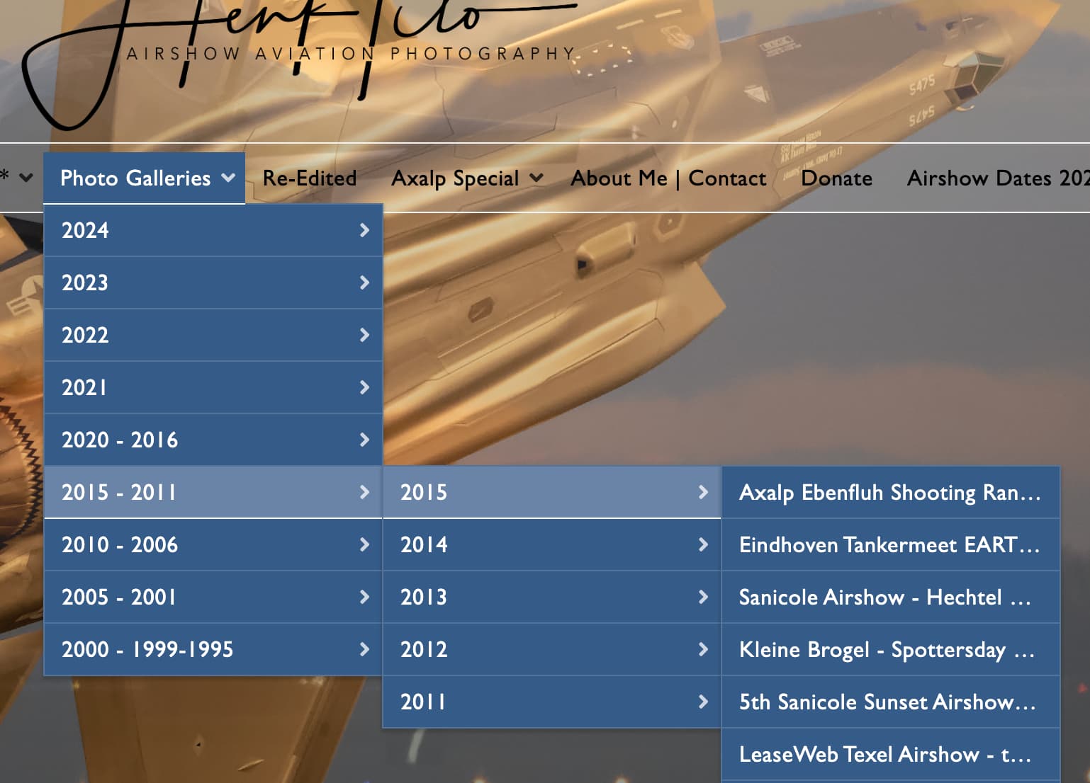
I have a question about Backlight’s menu structure. I see a difference in the standard Pangolin version and the Kookaburra version.
In the Pangolin version it goes well, in picture 1 you can see that the menu structure folds out nicely (Galleries - Airshow Aviation Photography by Henk Titosee menu > Photo Galleries).
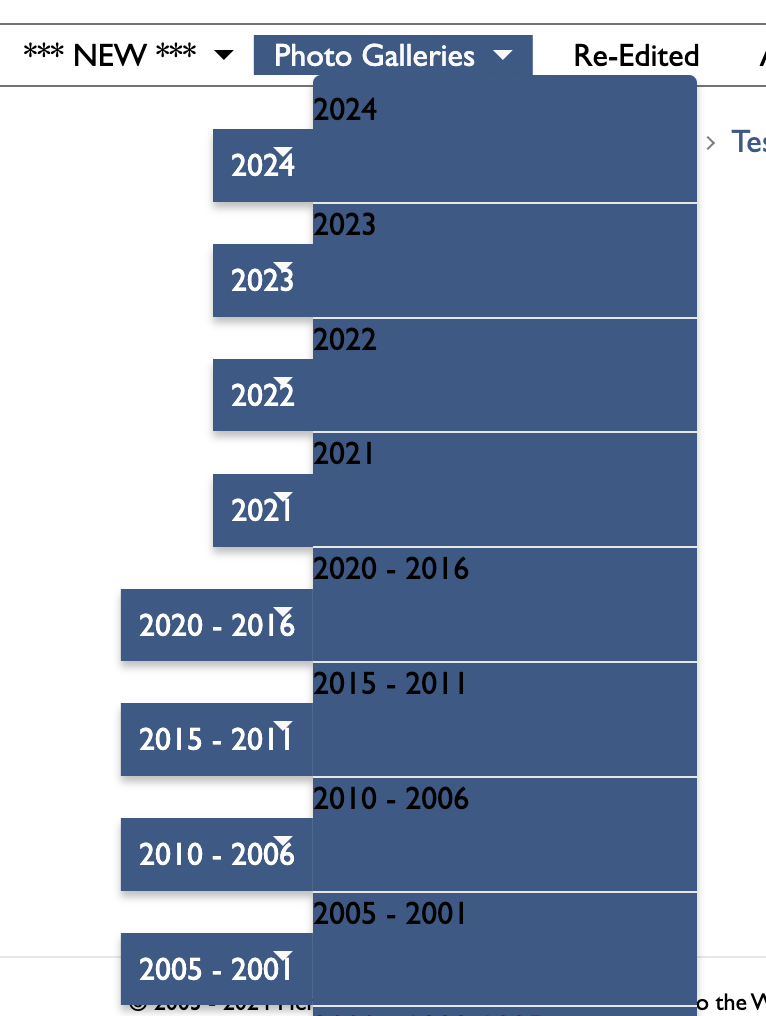
Kookaburra is focused on keyboard accessibility, and the simple fact is that menus such as you have shown in Pangolin are a keyboard-accessibility nightmare. And actually, a mouse-accessibility nightmare as well, for people with motor impairments, and even for people without any impairments whatsoever (I personally see a menu like that, and I don’t want to engage with it). Dropdown menus in Kookaburra are supported to a depth of one. This is intentional, and meant to discourage exactly what you’re showing from Pangolin.
It is a far better experience, both for navigation and for readability, to click into the album set to find an album, rather than to drill through a complex network of drop-down menus.