Excess spacing on album page

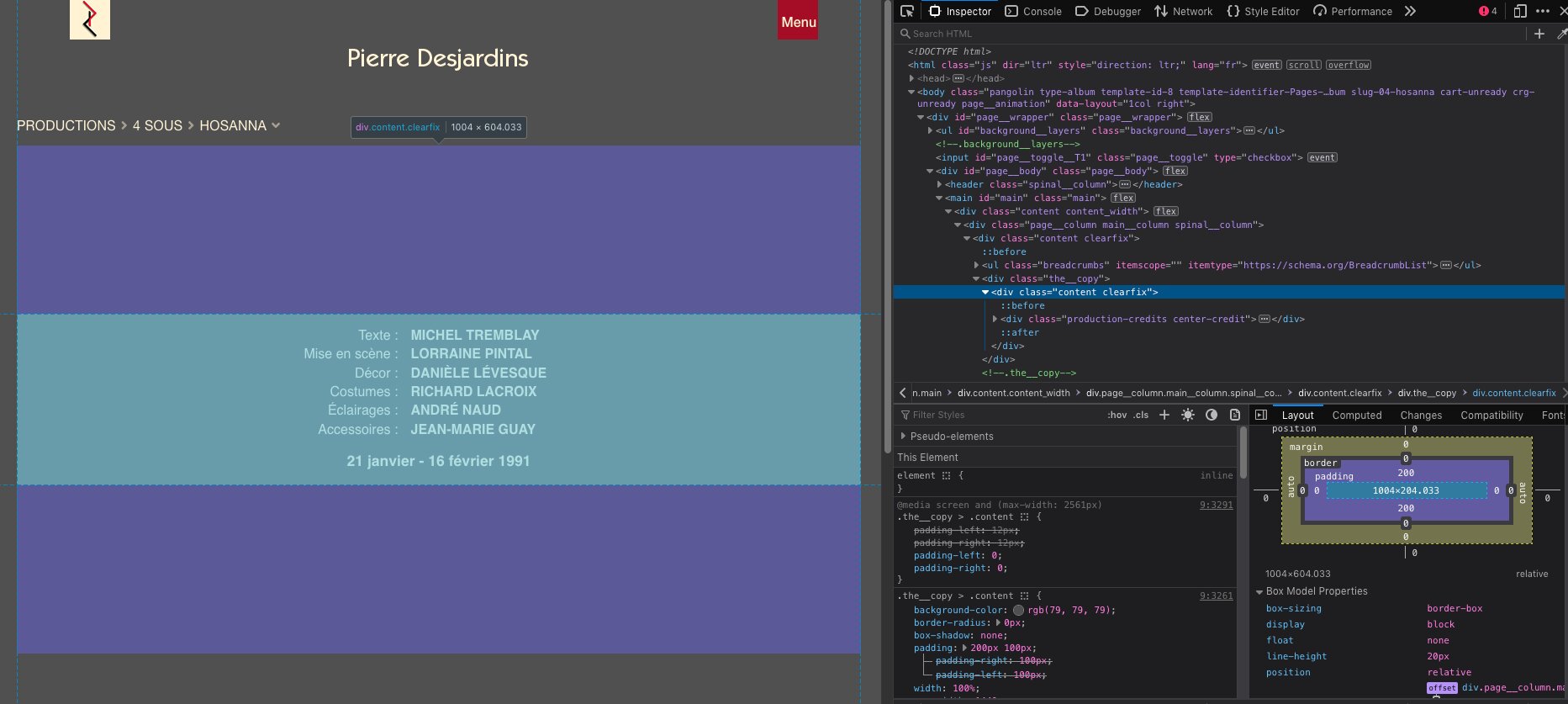
I’ve addressed this issue before, but I still can’t the layout I want: there is too much padding between the album thumbnails and the credits and the top of the page.
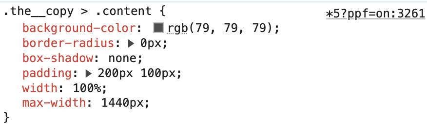
In backlight/Pages I put a padding value of 200px to account for the ABOUT page.So, I am trying to target that section…In inspector, I see this:

But where is the ID? I tried to use “content clearfix” in the CSS but nothing happens.

Your screen shot doesn’t show which css file that padding is coming from

If you need to target only the About page, do that in custom css using the slug-xxxx class for the About page, which is found in the body tag

A link to the site would help

I’m sorry about the missing link.
The About page is https://pideja.ca/about/
And the credits are in every album.
The latest one is :
https://pideja.ca/galleries/01_duceppe/2025-2026/02-corps_fantomes/

I can only look on my ipad right now (probing is limited), but it looks like all that padding is coming from your page template.
Set the padding for what the majority of the site needs and address the About page with custom css.

Have a look at the padding settings in Backlight designer:

For once, I don’t think you need to use custom css :slight_smile:

I am aware of the situation. I have corrected the top-bottom padding to 20px in the Pages-pideja/Content area/Main Colum/Main copy, and it works fine, all the more since I now place the credits below the thumbnails.
However, I now have to find the correct way to correct the padding on the ABOUT and the CONTACT pages.

Maybe

.pages-template-identifier-about .the__copy .content {
    padding-top: 200px;
}

and

.pages-template-identifier-contact .the__copy .content {
    padding-top: 200px;
}

or for both pages at once

.pages-template-identifier-about .the__copy .content,
.pages-template-identifier-contact .the__copy .content
 {
    padding-top: 200px;
}

Seems to work fine on the large scree, However, on the mobile phon, not so good.

/@media only screen and (max-device-width: 768px) {
  .the__copy {
    font-size: 1rem;
    line-height: 1.5rem;
    margin-top: auto;
  }
  
.pages-template-identifier-about .the__copy .content,
.pages-template-identifier-contact .the__copy .content
 {
    padding-top: 10px;
}ype or paste code here

There’s a syntax error:

/@media only screen and (max-device-width: 768px) {

Did you notice the leading forward slash? Remove it and try again.

Looks like there could be a missing closing bracket too?

It looks like, but the CSS file has the correct closing bracket.