I’m left wanting when it comes to viewing a best fit size for images on a phone. I’m using BL 3 and Pangolin.
Ideally I’d like a way for photo presentation to take over the screen. It would be under user control, like clicking the zoom window button (like you can get in YouTube).
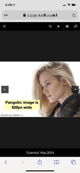
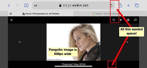
Here’s an example (see attached images), showing how rotating the phone to wide actually makes the photo more narrow. I understand how landscape shortens the height of the viewing area. It has to make space for captions, BL UI, the browser’s address bar, and finally its row of tabs.
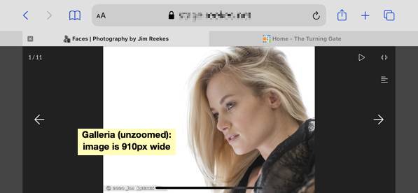
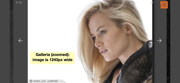
I was experimenting with Galleria. I like how it can hide the UI elements and footer. I have a few feature requests for Galleria, but without it having a gridview it’s a non-starter for me. Sadly without the (masonic) grid view Galleria is a non-starter. Argh.
I think I want to combine the grid view available in Pangolin with the slide show of Galleria.
I was thinking I could use PHP plugins or maybe CSS to remove the footer and captions while the phone is in landscape mode. (eh, can a media query tell me this?). This would make the image area taller (and therefore images can be wider). Taking this path ends up hacking Pangolin into Galleria. Or before I go into the weeds and off a cliff, maybe I can do something simple like make the UI and caption area overlay (and transparent).
I was thinking of something like that, but then how would I know the right width? What I’m actually attempting to target it a mobile device (with a small screen) in landscape mode. It’s more than just width.
Also I gave it a quick try, and I couldn’t find a way to hide the footer or caption in CSS.
are you using the browser inspector to locate and target the proper selectors?
I know the target, but haven’t found the css magic to remove captions or footers.
For example, changing .fancybox-caption to visibility: hidden and adding display: none hides the caption, but doesn’t return that space to the “stage” for the image.
Seems like the sections are calculated and coded into the html/css before the page is rendered. So then modifying a portion after the page is rendered doesn’t work.
device widths for various devices and the use the width that will cover them all.
But the problem is actually height, right?. When the phone is held in landscape, it’s got plenty of width. In my example, something like 2x the width of the photo. But due to the limited height the image is scaled accordingly.
Let’s go back to the problem before venturing down this path.
How can we increase the available width (height actually) for photo presentation in Pangolin?
display:none; should work. Make sure you’re targeting any containing element. And your css may need to be more specific. In other words, the default css may use a more specific selector, which would take precedence.
Image width is going to depend on the height available for the vertical dimension of the image.
I don’t think that the Fancybox sideshow that Pangolin uses canhide browser elements, like the url address bar.
.fancybox-caption is the outer div holding the caption. Setting display: none on that hides that element. It does not return the space to the area used by images.
The problem is how .fancybox-content (also within the stage, above the caption) has inline styles hardcoding a specific height and width.
Try it, on any Pangolin slide show. Let me know how to grow the image size to fill the new space after removing elements.
Hiding the browser’s elements, like the address bar or tabs, is outside of what CSS could possibly to. That would need some JavaScript. But I don’t know how to add JS to Pangolin’s slide show, and add a button to the Pangolin UI (such as a zoom option). Before even trying that, I think I’m hacking too much on Pangolin and venturing into the weed, heading off a cliff.
It’s the same result. This does hides the caption, but it does not make the images taller. The image height and width is coded as an inline style. Simply hiding the caption doesn’t effect the size of the image.
there’s more that can be done with css. I was able to make the images taller,but they were expanding to fill a space that was taller than what was visible, essentially cropping the image.
There may be other things that can be done to mitigate that and other issues I ran into but I didn’t want to start going down that rabbit hole.
And some of it might be tied to Fancybox’s javascript code too. And know very close to nothing about that.
Unless you’re clever with javascript and css (or someone clever happens along), I think you’re going to have to live with what Fancybox does.
Fancybox does have a Full Screen button that appears on desktop browsers but not on mobile devices. There was a discussion about that here. That might point you in a direction.
I give up on Fancybox creating larger images. It seem to have a zoom option, but I don’t see how to make that work.
But the two parts of what I’m looking for are available. 1) gridview in Pangolin, especially the Masonry view and 2) Galleria option for the slide show and viewing one image at a time.
It’s just that you can’t have both at the same time.
Yep. Galleria does not come with a grid option and Fancybox removes the zoom option for mobile.
Galleria does have a thumbnail strip, but it does take up space on the screen.
I’m adding a strong feature request. If there were only one thing I could get, I would like Galleria for single image viewing and gridview in Pangolin.
But there absolutely a way to have a grid view for thumbnails (like the Masonic layout) and a large/full screen presentation of images (like Galleria).
Yes, but they are two different products, most likely with incompatible code.
The grid views come from Fancybox and I really doubt there is a way to call a specific large image from a thumbnail in Fancybox to open in Galleria.
I seem to have caused confusion. I’m not asking to change fancybox or galleria necessarily, or trying to integrate them. I’m asking for a gridview that has a large single image presentation. This seems very doable.
Galleria implementation in Backlight has reached its natural conclusion. Development of Galleria itself seems to have stalled.
The current version of Galleria, 1.6.x is two years old, and contains only very minor changes compared to the 1.5.7 version; before that, 1.5.7 was untouched for two-and-a-half years.
Galleria is jQuery based, and jQuery is out-of-fashion, and so I fully expect that library not to receive any more attention, nor am I inclined to give it any of mine.
Our implementation already has a grid view of thumbnails. It’s one of the options. You can see it here: