I tried it again, and saved a few times and cleared cache and none of the settings in Main Copy have any effect on the slideshow dimensions. As a test, I set the background to yellow and set the width and borders to maximum. The Galleria slideshow remains at maximum page width.
But the Gutters work and look fine on my iPhone 8. No extra padding. The only thing there is how do I remove the mobile “hamburger” menu. This Album Set has no menu.
try disabling vertical navigation in the album’s page template.
But if you need that mobile navigation on other albums or pages using the same page template, then clone the existing page template, disable the vertical navigation, and assign the page template to the Galleria album template.
I think that should do it.
That worked, thanks. One final weird thing, the two thumbnail photos sometimes are broken, and what’s stranger is on it’s even different on different devices. Currently, they both appear on my desktop, neither of them appear on my laptop, and one of them appears on my cell phone. I’m guessing this is a Publisher problem, so I’ve tried to upload them again several times, I even tried changing the photo and uploading it and then setting it back to the one I want - same thing. I’ve also cleared cache in all cases.
I’m not sure what you’re referring to since we can’t see anything.
are you talking about the cover images that appear in the album set?
this is also getting way off the original topic. If you have more issues, can you start new topics? That really helps if others are having similar problems.
I figured it out. Because I’ve put the password on the albums, it won’t show the thumbnail images on the Album Set page until after you’ve put in the password.
Sorry about going off topic. I’m finished with this project and have learned a lot about how to proceed to do other ones. Thanks again Rod, for your constant speedy responses and accurate information.
Getting back to this, the page width indeed controls the width of the slide show. The Masthead cannot be positioned to the left of the entire browser (unless you set a very wide width, but as you’ve seen, that effects the gallery width).
You can, however, have a background color or image in the masthead that will span the width of the browser, but the masthead itself will stay within the constraints of the page width set in the template under Layout.
You may be able to use the css position property to take it out of the document flow and position it at the upper left.
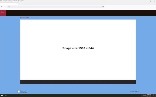
This is what I found worked for me. Here’s my final layout:
The small red square at the top left is my logo image (uploaded in Masthead Logo Image) and it is flush left on my laptop and desktop computers, and on mobile where there is no additional padding caused by the Gutters setting.These are the settings I used:
Page Templates
-> Layout
Max-width 2556 (maximum)
Gutters 250 (maximum)
Album Templates
-> Image Renditions
Photos
Width 1500
Height 844
-> Photo Presentation
Aspect Ratio X - 16
Aspect Ratio Y - 9
The Max-width setting in Layout controls the entire page, so yes, the background color will remain full width, but moving the slider from maximum moves the logo image in along with the slide show.
The settings in Page Template Content Areas have no affect on the slideshow, I presume because it is meant for the text, if there is any, in Pages -> Page Copy.