I may be running before the starting pistol has gone off but I’m trying to see where things get done in Kookaburra.
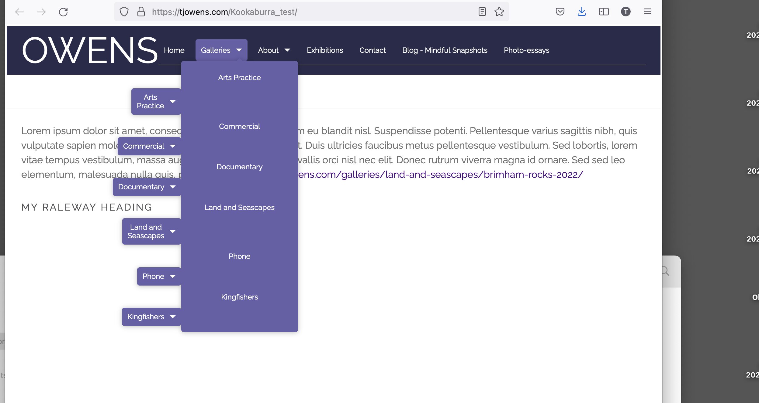
One thing I’ve noticed having cloned my Pangolin menu is the display is nothing like it (deliberate change in colour to give me a vsual reference when I preview the test page in browser.
I tried to capture a still of the Pangolin menu but ended up with a video so best seen at www.tjowens.com
I see that Pallets don’t feature in the layout anymore and the ‘Hamburger’ menu items are not available when viewing in tablet or mobile mode. Is this something that is being dropped or scheduled for a later timebox?
If I’m jumping the gun then please tell me
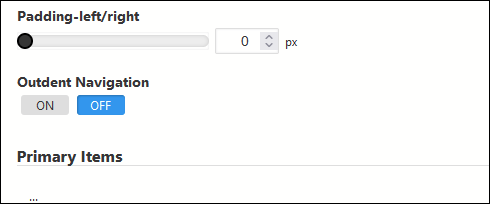
Not sure what “Outdent Navigation” does, but by the name, it seems like it might cause what we’re seeing. So far I see no difference whether it’s on or off.
Edit: It moves the main nav menu, basically removing padding it looks like.
I was doing a little playing with Kookaburra yesterday and noticed this myself. It made me wonder if there is any kind of post somewhere that explains the basics and the terminology it uses. I searched and looked but didn’t find anything. I realize it may be early in the game for that, but it never hurts to ask.
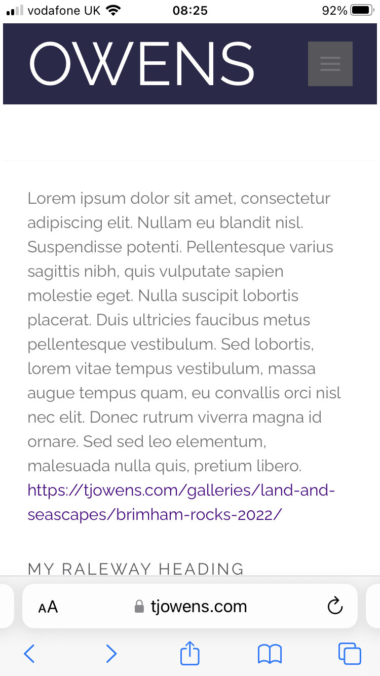
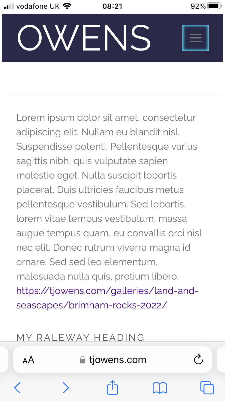
Re: the mobile menu button. I’m finding that in Firefox, the hamburger menu lines are not appearing. The
The hamburger button background color shows though. Just not the lines.
I tried switching that on without changing any of the defaults and the Title crashed into the menu. Switching it off gave some breathing space to the First menu item
First and most important thing, we’re team pancake over here. It’s a pancake menu.
Seems Firefox doesn’t like inline attributes on SVGs, which is utterly ridiculous. I’ll have this fixed in our next release, but use this CSS in the meantime:
For the menus, Kookaburra supports only one descendent. Please set your menus accordingly.
I feel that menus any deeper than that become tremendously unwieldy for keyboard users, and keyboard accessibility is a key tenant of Kookaburra. I have mentioned this in places in the docs, but I’m sure it’s easy to overlook.
Oh, and I haven’t decided yet what’s up with columns/pallets yet. Not currently supported. May or may not be supported in the future.
Again, keyboard accessibility. In pangolin, it’s possible to put the navigation in the righthand column, and that’s not going to work for keyboard accessibility. We need to be able to tab into the navigation immediately, so cannot place the nav markup after the body markup. I could put the markup in the right order then use CSS to position it visually, but that the visual order wouldn’t be a match to the tab order, which is also a problem.
So whatever I end up with, I am separating navigation from pallets. If pallets happen in Kookaburra, they will differ from Pangolin.
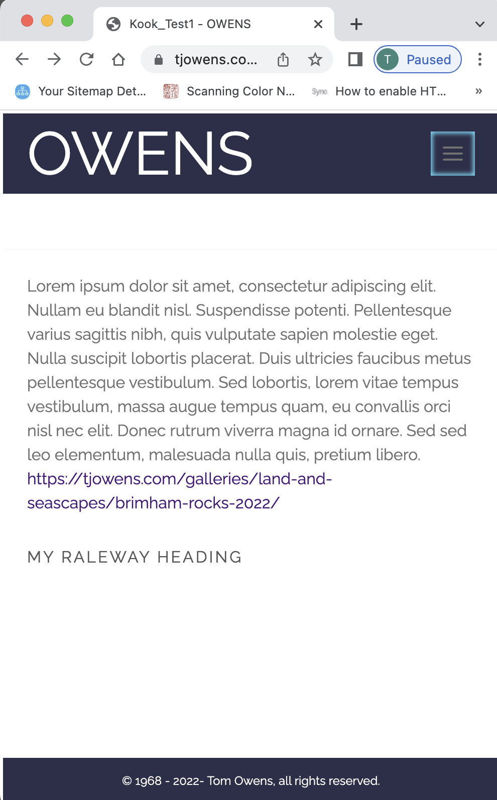
Pancakes OK
OK. I’ve kicked the menu descendants into the long grass and the weird menu stuff has gone away.
I added the code snippet to my CSS file but can’t help thinking that something extra is required as there is a warning triangle against each line of that snippet. I’m not a coder so it might just be something simple to add as no pancakes show in my pancake button.
Happy to wait for the next release to sort that though. I keep CSS stuff to an absolute minimum.
Thanks. TomO
Hi Rod,
I’ve done some more testing this morning. First on the iPhone8 iOS 16.2 Safari and the pancakes show up. If I click the pancake then the menu appears on the right hand side. If I select another menu item that takes me back to a pangolin page that works as expected but using the back button on the browser to get back to the test page the pancake displays differently.
Chrome on iMac
The same behaviour in Windows 10 on Parallels using Firefox.
Maybe the display issues on both iPhone, iMac and Windows 10 are to do with moving back and forth from a Kookaburra related menu to Pangolin or maybe I’m just conjuring that idea up as a reason?
If I get an opportunity over the break I’ll try installing a fresh instance of Backlight in another of my domains that is purely Kookaburra.
Thanks.
TomO
 Pancakes OK