While working through a BL 6.3 upgrade problem checked my mobile website (Samsung - Chrome, Opera, Firefox, Samsung native), not just using a narrow tab on my PC, I find that the Search menu option is not present. Not sure if it ever was actually - the last item is being truncated in some odd way on Kookaburra template album/sets. The Pangolin based menus are preserved.
I fixed the problem by adding a blank placeholder in my menu set and the Kookaburra mobile menus all seem to display properly. My PC browser menu is aesthetically preserved.
I’m confused what’s going on here.
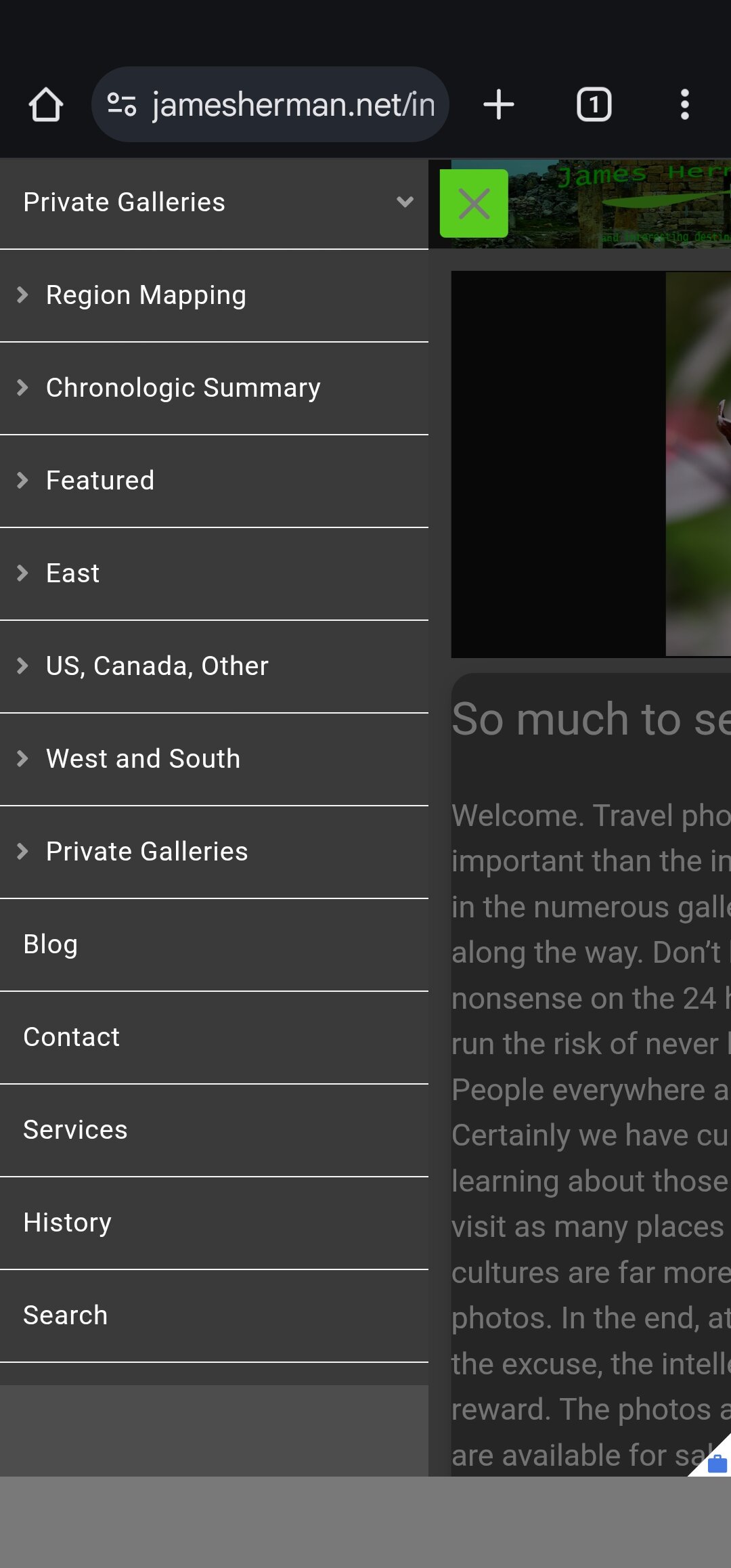
Much better with pictures. Pangolin mobile menu with all menu items visible.
Kookaburra mobile menu with last menu item truncated, more likely hidden.
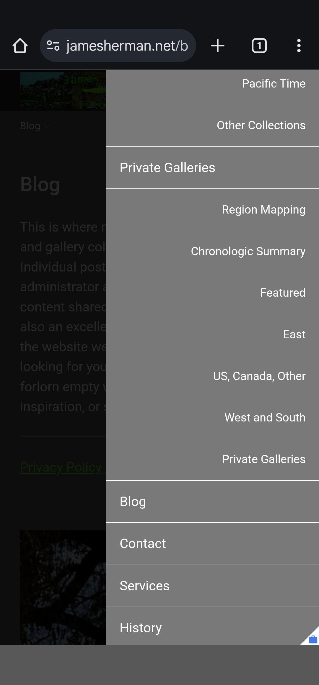
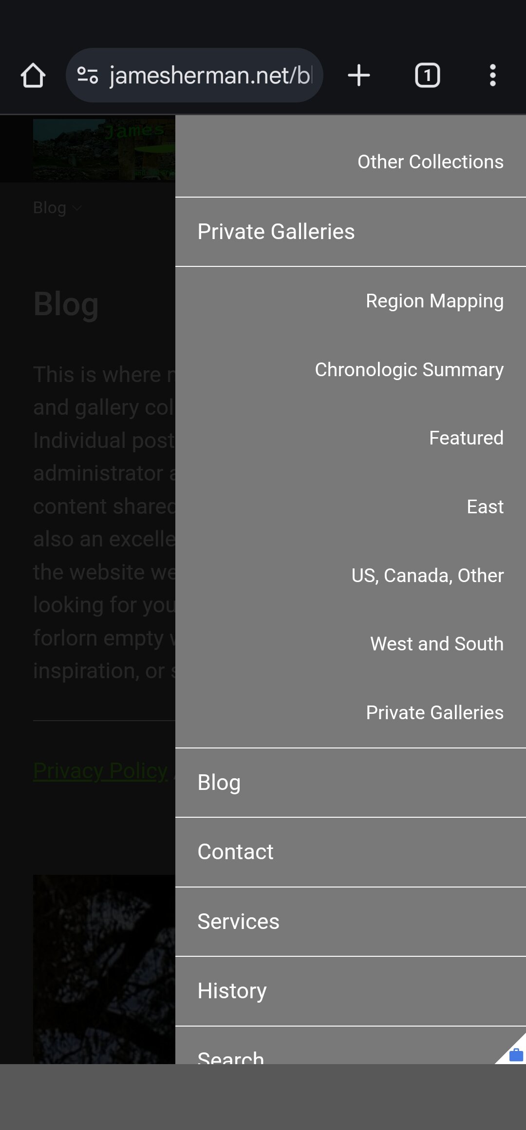
Kookaburra mobile menu with a placeholder menu item added.
All three examples use the same menu set for both Pangolin and Kookaburra template based albums and album sets. Does not seem to matter if portrait or landscape mode.
Is the menu not scrolling?
The menu scrolls, just stops too soon on the Kookaburra template based pages. In the interim, I also stole my wife’s iPhone and it has a similar problem, but my pseudo entry at the end of my menu set doesn’t seem to fix the problem, I am unable to select the last menu item.
A sample Pangolin page is my home page, it contains a table and I have not yet converted it to Kookaburra.
And a sample Kookaburra page with the same menu set is:
https://jamesherman.net/galleries/
Take a look at them both on a smart phone, not just on a narrow browser tab. Everything looks fine on the latter and I did not appreciate the problem until I physically tried on my Samsung. Looks like we may need to add some margin space at the end of the menu on Kookaburra similar to that present on the Pangolin templates.
I see. Seems to be an issue with mobile “safe areas”. I will look into it. The page is supposed to handle that, but maybe the modals are outside the umbrella that handles it.
Hi Matt, I have the same problem. The mobile menu does not scroll to the end, so that “Contact” is not visible or clickable at all.
I would be very grateful for a solution as soon as possible 
Thank you and best regards,
Oliver
Sorry, I’ve been recovering from a bad case of (probably) bronchitis, so haven’t been able to work on this until today.
But I’ve just been implementing a fix locally. Will hopefully have a release soon.
Hi Matt,
then I wish you a good recovery and since today is Pentecost, also a lot of enlightening thoughts 
best regards,
Oliver
Thank you!
This should be solved in 6.3.1, now available.
Installed 6.3.1 and checked both iPhone and Samsung and the Kookaburra menu problem is resolved.
Thank you,
James.
1 Like
Yes, thank you!
but on my tablet it is very small with:
@media screen and (max-width: 1024px) {
  .side-navigation .nav--decorations {
    align-items: center;
    border-bottom: 1px solid var(--color-contrast);
    display: flex;
    gap: 6px;
    height: 50px;
    justify-content: flex-end;
    padding: 7px;
    text-align: right;
  }
}
Best regards,
Oliver
@volvoxturbo That code only impacts the row that contains the search button and language select. I’m unclear what you’re citing as a problem with it.
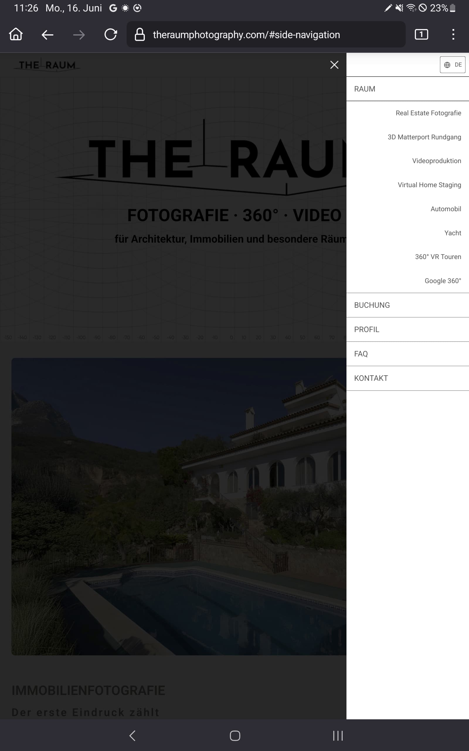
Hi Matt,
perhaps the screenshot explains what I mean. The menu is somewhat small in relation to the screen size
Best regards,
Oliver
Look for the “Drawer Width” option in the template designer.
1 Like
Hi there,
I still have a problem with the drop down menu in Wordpress, see The Raum Photography – Booking
it works on desktop but not on a smartphone size. It is still visible after clicking on a drop down menu link. Not sure if this is a pangolin thing 
Best regards,
Oliver
Well, it’s meant to navigate to a new page. I’m not sure what’s going on with your content area, but the menu looks like it’s just activating different pieces of an accordion. Is that some kind of plugin you’re using? That’s not at all what the WP Theme navigation was built to work with; your content isn’t being powered by our theme.
Hi Matt,
it’s just a simple accordion like this:
    <div class="accordion-item">
    <button id="accordion-real-estate" type="button" class="accordion-button accordion-button-1" onclick="toggleAccordion(this)">
     IMMOBILIENFOTOGRAFIE
    </button>
    <div class="accordion-content accordion-content-1">
      <div class="accordion-content-inner">Inhalt für Accordion 1</div>
    </div>
  </div>
The menu of the Pangolin theme for WP works on desktop. It also works on a mobile device, but one have to close the drop-down menu manually.

I suggest adding a JS event listener that closes the menu when you want it to close.
document.addEventListener('click', function(event) {
  const anchor = event.target.closest('.nav_v a');
  if (anchor) {
    // do whatever here
  }
});
Hi Matt,
thank you!
I got this with the help of chatgpt - your code at the bottom:
<script>
  function toggleAccordion(clickedBtn) {
    const allButtons = document.querySelectorAll('.accordion-button');
    const allContents = document.querySelectorAll('.accordion-content');
    const content = clickedBtn.nextElementSibling;
    const isOpen = clickedBtn.classList.contains("active");

    // Alle schließen
    allButtons.forEach(btn => btn.classList.remove('active'));
    allContents.forEach(c => c.style.maxHeight = null);

    // Wenn vorher zu, dann öffnen
    if (!isOpen) {
      clickedBtn.classList.add("active");
      content.style.maxHeight = content.scrollHeight + "px";

      setTimeout(() => {
        const elementTop = clickedBtn.getBoundingClientRect().top + window.scrollY;
        const offset = window.innerHeight * 0.2;
        window.scrollTo({ top: elementTop - offset, behavior: 'smooth' });
      }, 300);
    }
  }

  // Schließe Accordion bei Klick auf Links darin
  document.querySelectorAll('.accordion-content a').forEach(link => {
    link.addEventListener('click', () => {
      document.querySelectorAll('.accordion-button').forEach(btn => btn.classList.remove('active'));
      document.querySelectorAll('.accordion-content').forEach(c => c.style.maxHeight = null);
    });
  });

  const hashToIdMap = {
    '#real-estate': 'accordion-real-estate',
    '#matterport': 'accordion-matterport',
    '#360vr': 'accordion-360vr',
    '#video': 'accordion-video',
    '#staging': 'accordion-staging',
    '#automobile': 'accordion-automobile',
    '#yacht': 'accordion-yacht',
    '#google360': 'accordion-google360'
  };

  function openAccordionByHash() {
    const hash = window.location.hash;
    const buttonId = hashToIdMap[hash];
    if (buttonId) {
      const button = document.getElementById(buttonId);
      if (button && !button.classList.contains("active")) {
        toggleAccordion(button);
      }
    }
  }

  // Accordion öffnen beim Laden
  window.addEventListener('DOMContentLoaded', () => {
    openAccordionByHash();
  });

  // Accordion öffnen bei Hash-Änderung
  window.addEventListener('hashchange', () => {
    openAccordionByHash();
  });

  // Hash auswerten, falls direkt aufgerufen
  if (window.location.hash) {
    window.dispatchEvent(new HashChangeEvent("hashchange"));
  }

  // ✅ Menü schließen bei Klick auf Menü-Link (von TTG)
  document.addEventListener('click', function(event) {
    const anchor = event.target.closest('.nav_v a');
    if (anchor) {
      document.body.classList.remove('nav-open');

      const overlay = document.querySelector('.page__overlay.spinal__column');
      if (overlay) {
        overlay.style.display = 'none';
      }

      const menuToggle = document.querySelector('.page__toggle__T1');
      if (menuToggle && menuToggle.classList.contains('active')) {
        menuToggle.classList.remove('active');
      }
    }
  });
</script>
but it doesn’t work.
Any other ideas?
Best regards,
Oliver