On to the Mobile display

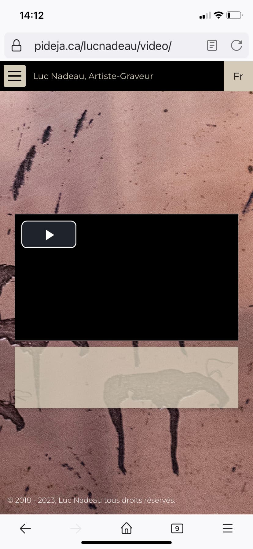
Still in testing for pideja.ca/lucnadeau and it’s looking good, thanks to Rod and Daniel.
There are still a few odds and ends on the mobile display though:

  • the padding for the text on the BIO and the EXHIBITION pages is none existent. Trying to control thru CSS but having a hard time targeting the correct area;
  • The images on the PHOTOS page are too small. It took me a while to have them (almost) correctly sized on the larger viewports so I am leary of disrupting everything;

These issues could be resolved using media queries, I suppose but it’s the targeting that eludes me.

UPDATE: found and fixed the mobile issues, at least it looks like it now.
Here’s my code:

/* Mobile display*/
@media screen and (max-width: 600px) {

    /* textes marges ajustées */
    .the__copy>.content {
        background-color: rgba(213, 204, 185, 0.8);
        border-radius: 0px;
        box-shadow: 0 2px 4px -1px rgba(0, 0, 0, 0.06), 0 4px 5px 0 rgba(0, 0, 0, 0.06), 0 1px 10px 0 rgba(0, 0, 0, 0.08);
        padding: 50px 50px;
        padding-top: 50px;
        padding-right: 50px;
        padding-bottom: 50px;
        padding-left: 50px;
        width: 100%;
        max-width: 1280px;
    }

    /* slide show image */
    .album-template-identifier-diaporama .the__gallery>.content {
        background-color: #0000;
        box-shadow: 5px 10px 20px 10px #888888;
        box-sizing: border-box;
        text-align: center;
        width: 80%;
        max-width: 600px;
    }
}

It might need some cleaning up...

should be used on all pages and not just on small screens. This way, your text would be much easier to read.

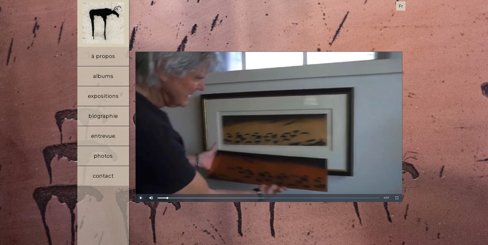
Nice site. I Like the use of the vertical menu that cascades out.

A couple of comments, although they are mainly design related and therefore a matter of personal preference.

I’m not a big fan of the index page (About). I think it would benefit from a single bold image (like the one at the top of the menu) with the text underneath, rather than a background image which is too bold to be a background yet not visible enough to admire the image.

Similarly on the Albums page - the background is distracting.

Text on About page needs more room to breathe within its box (you may have picked up on this in your question - not sure).

Mis-spelling of “Exhibition” in English version.

Thank you Daniel,
I set the CSS as you suggested. I see a noticeable change. I had the background at 50% maybe a bit weak.

1 Like

Hello Samosa,
I understand your concerns about the…ABOUT and the ALBUMS pages. I will be talking it over with Luc to see if he shares these issues. Thanks for your input.

UPDATE: We’ve decided to keep the pages as they are, for now. We feel that on the larger monitors it doesn’t hinder the experience that much.

Thanks again for your always welcome comments.

I did use Daniel’s suggested CSS script, but something else is bothering me:

The INTERVIEW page looks “normal” on a larger monitor, but on the mobile display, there is a beige rectangle appearing.
Mobile

Work station monitor

I can’t find the setting for that. Probably a CSS media query would fix it, but I can’t target that rectangle.

UPDATE: I found it in a media query:

 .the__copy>.content {
        background-color: rgba(213, 204, 185, 0.5);
        border-radius: 0px;
        box-shadow: 0 2px 4px -1px rgba(0, 0, 0, 0.06), 0 4px 5px 0 rgba(0, 0, 0, 0.06), 0 1px 10px 0 rgba(0, 0, 0, 0.08);
        padding: 50px 50px;
        width: 100%;
        max-width: 1280px;
    }

But it doesn’t discriminate between the pages. I’d like it to be “no color” on the INTERVIEW page only.

Then just target that page with a transparent background color. Use the the slug body tag.
See:

I wrote this, based on what I found in the source code page, section:

<body class="pangolin type-page template-id-38 template-identifier-luc_video pages-template-id-39 pages-template-identifier-video album-template-id-41 album-template-identifier-luc_video slug-video cart-unready crg-unready" data-layout="2col left">


luc_video is the page identifier.

.album-template-identifier-luc_video {
background-color: transparent;
}

But it affects the whole page ( I tried with colors to see) so, I’m at a loss as to what that beige rectangle is all about.

I found it!

Needed to take a hint from the rest of the site’s CSS media query. So I corrected the code to:

 .album-template-identifier-luc_video .the__copy>.content {
    background-color: transparent;
}

Now, it works!

Thanks Rod, you are very patient…We had been thru this before for the exact same site.