I am pretty sure I saw this on one of TTG’s You Tube videos but can’t find it again.
When wanting to see how a page is displayed on various screen widths including iPhone, iPad etc etc there appears to be a page or maybe a browser plugin to select a virtual screen size.
So you can see how a gallery or album will display on iPhone for example without getting your iPhone - if you have on - out.
Anyone have any idea what I’m on about?
Safari macOS user!
there are a couple of things to try
One is simply resizing the browser window on the monitor.
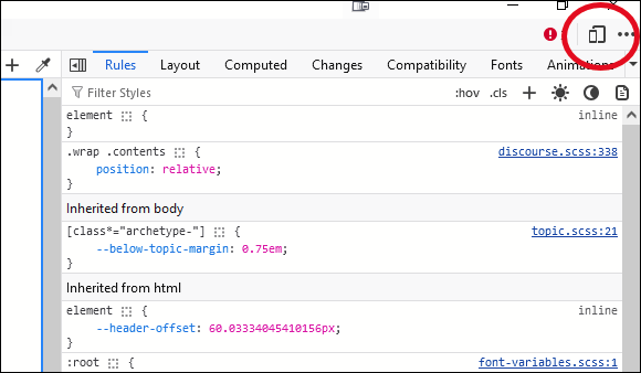
Another is to use the browser’s Inspector. You can access that from the developer tools item in the Tools menu (this might differ between browsers).
Once you’re into the Inspector, look for controls that emulate different devices. They’re often near the top.
1 Like
Maybe its this… Responsive Design Mode | Apple Developer Documentation
But it involves installing Xcode which I remember is a big complex app.
You shouldn’t need a special plugin or installation. I think all browsers have the Inspector tool built in. Firefox, Chrome, Brave, Edge, and Opera all have it.
I don’t know about Safari, but I imagine it has developer tools as well.
This is from the Firefox Inspector. In the upper right is the Responsive Design Mode button
1 Like
Found the video at https://www.youtube.com/watch?v=_f8NHn6u_To where the thing I’m on about shows up at 2min 10sec.
This now looks like the Develop Tool in Safari I mentioned above, perhaps with the additional views after installing Xcode?
Maybe @Matthew can confirm or comment?
Thanks!
In Safari, you have to go into the settings to enable Developer options. In Chromium based browsers, you should only need to open the dev console to find the responsive design features.
That’s what you’re looking for, btw: Responsive Design features.
You would only need Xcode and its simulators if you were developing an app, which you are not. Extremely overkill for what you need. You should be able to do all you need to do within the browser, either by resizing the browser window to whatever size, or by using the responsive design tools now present in every major browser.