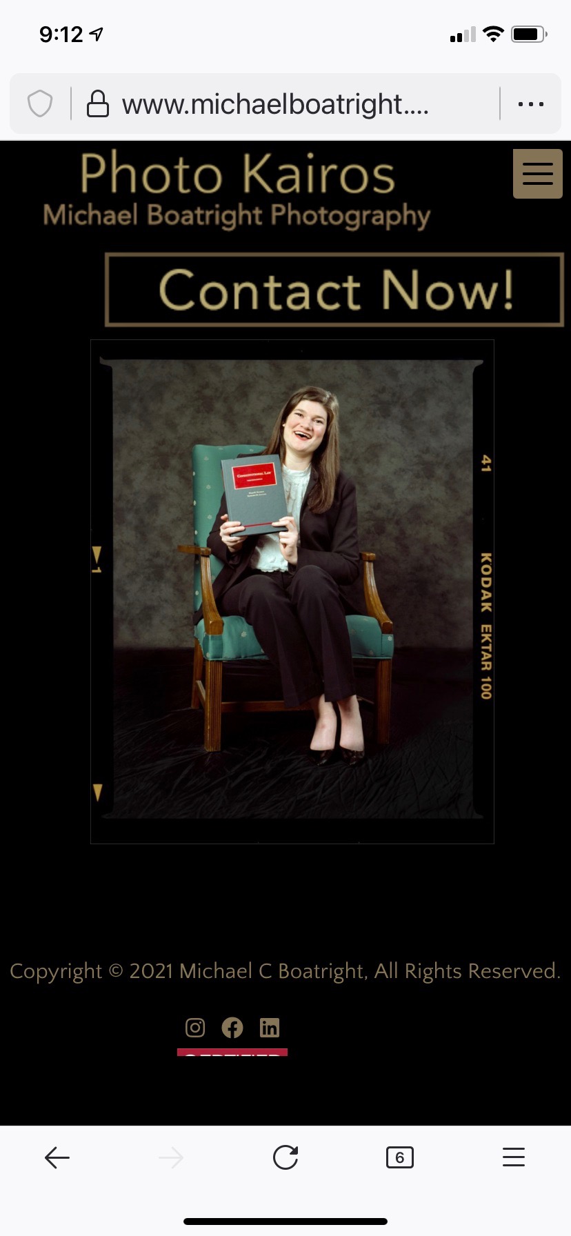
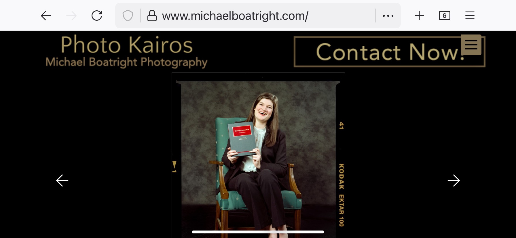
I am in the process of reworking my site to follow recommendations from Donald Miller’s “Storybrand.” It recommends I put my site logo on the upper left and a call to action on the upper right (and lots of other things… you have been warned!).
Not wanting the social media icons in the upper right, I followed Rod Barbee’s tip for using phpplugin masthead_primary_top hook to place my logo png with class=“alignleft” and the call-to-action png with class=“alignright”:
which works great on desktop, but looks really wonky on mobile, especially in portrait orientation.
The menu stays in the same upper right corner in both orientations. I read about moving the menu, but not sure if I’ve messed something up with my hook or what.
Note, I also added this in my custom css:
.page__pallet__top > .content > ul > li {
margin: 0;
}
which makes sure I’m at the top of the page.
website is https://www.michaelboatright.com
The align* classes are intended for content — adopted to be be Wordpress friendly — and are not meant to be used in the masthead or top bar.
My bad. After my struggles with GoDaddy and CE3 (GD kept treating Lightroom uploads as a DDOS attack) I took a couple of years foray in WP before Backlight came out and helped me get out of my WP foolishness (although I still manage a WP site for a client). Some habits are hard to break.
My challenges is figuring out which classes are used for what in the various sections of BL. Especially, I still haven’t groked how you use ul’s and li’s and what classes are used to wrap them.
One other thing I’m not sure of is how in the phpplugins to know what screen resolution is (which from various discussions, I understand to tell me if I am desktop or mobile).
Finally, I notice on backlight.me, you move the menu to the bottom of the screen/page on mobile—how did you do that? Template? Phpfunctions?
I guess I’m kind of like Matthew Broderick in “Wargames”…”Let’s play Thermonuclear war.”
Thanks.
that’s done in css. Look up Media Queries.
AND … I’m still needing some help. I know I shouldn’t be using alignleft/alignright, but it seems to be the only thing that works even closely to getting my second png to align on the right. No matter what class I use to put my div on the right, it simply puts it inline, to the right of the logo. I’m not the most adept css guy, but I would help if I could look at the entire css used by Backlight. I have the example customizations, but can’t figure out what i should you to force the second image to the right.
I see in the web debugger that Backlight generates its CSS on the fly, but is there any way to get a breakdown of the default CSS for each section of the Pangolin page (masthead, primary_masthead, secondary…, pallets, footer, etc.? And also a clue on how the ul and li tags are used in Pangolin?
Thank you!
You’re adding elements into the header. There aren’t really pre-defined classes for you to do things in that area, so just use CSS. The float or position CSS properties ought to be useful here for sending things to the left or right. Or rebuild the header entirely, using PHPlugins, and implement a flexbox for layout. You can do pretty much whatever you want up there.
Thanks, Matthew. I had done in CSS in a while so I was a tad rusty, but I got float (and didn’t wait around to see what kind of mess I could make without a clear!) working.
It looks like on mobile there’s an absolute that puts the menu smack in the upper right. Can you override that class (and if so, what is it?) to move it below the masthead and then shrink the logo and call-to-action?
You can try changing the mobile menu position in the page template under Layout > Pallet(s) Position. Set it to Left. It may interfere with your Masthead. If so, you can also try setting the Top Pallet to Has Height on Mobile.
Thanks, Rod. That worked. Next I will use media queries to change the size of the logo and C2A buttons and give the C2A button at tel: url.
Did some looking into viewport sizes on mobile devices. I didn’t realize they were so small! Wow, even on honking screen resolutions, the viewports are pretty limited on mobile. I remember 20 years ago with a web startup, we were beginning to use WAP, but I thought we were so past that. Some things don’t change so much I guess.
Appreciate all the help.
Do you mean your masthead logo? No need for css, just use the Secondary Masthead option in the page template under Masthead. You’ll need to create a different sized logo and upload it.
The point is to put the Masthead logo on the left and the C2A on the right.