Hello, Is there a way to view how my website will look on a mobile device from within the Backlight admin? I thought I saw some information in one of Matt’s YouTube tutorials but I cannot locate it.
Not from within Backlight admin, but you can in the browser.
There are couple of ways. You could simply narrow down the browser window to mobile widths.
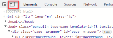
You could also use the mobile device emulators found in the browser inspector. For most browsers, I think you can just right click anywhere and choose “Inspect” from the menu that pops up. Once you’re in the Inspector, look for an icon that looks like a phone or tablet to access the responsive design mode.
It’s a little different in each browser. This is what it looks like in Chrome:
Rod, Thank you for your help! Michael
Exactly what Rod suggests. This is what I do 95% of the time. If you want something still more authentic, and you’re on a Mac, you can also download XCode to run the iOS simulator. Or you can download Android Studio for Mac or Windows. I think that’s extremely overkill, though, and I do suggest you just use the responsive tools available in the browser, as Rod suggests.
OK, Thanks Matt!