I’m having trouble getting a small gallery layout on a home page to behave on my ipad - it works as I’d like on iphone and desktop. I implemented this using the built in responsive grid feature. In responsive mode on the ipad (held vertically, horizontal is fine), the 3x2 grid of images is forced into a single column of images, which is fine. But the column is left aligned so it looks very odd to me - is there some way to cause the images to be centered down the page?
Here is a link to the page: https://bobcornelis.com/BacklightTest/homepagetest
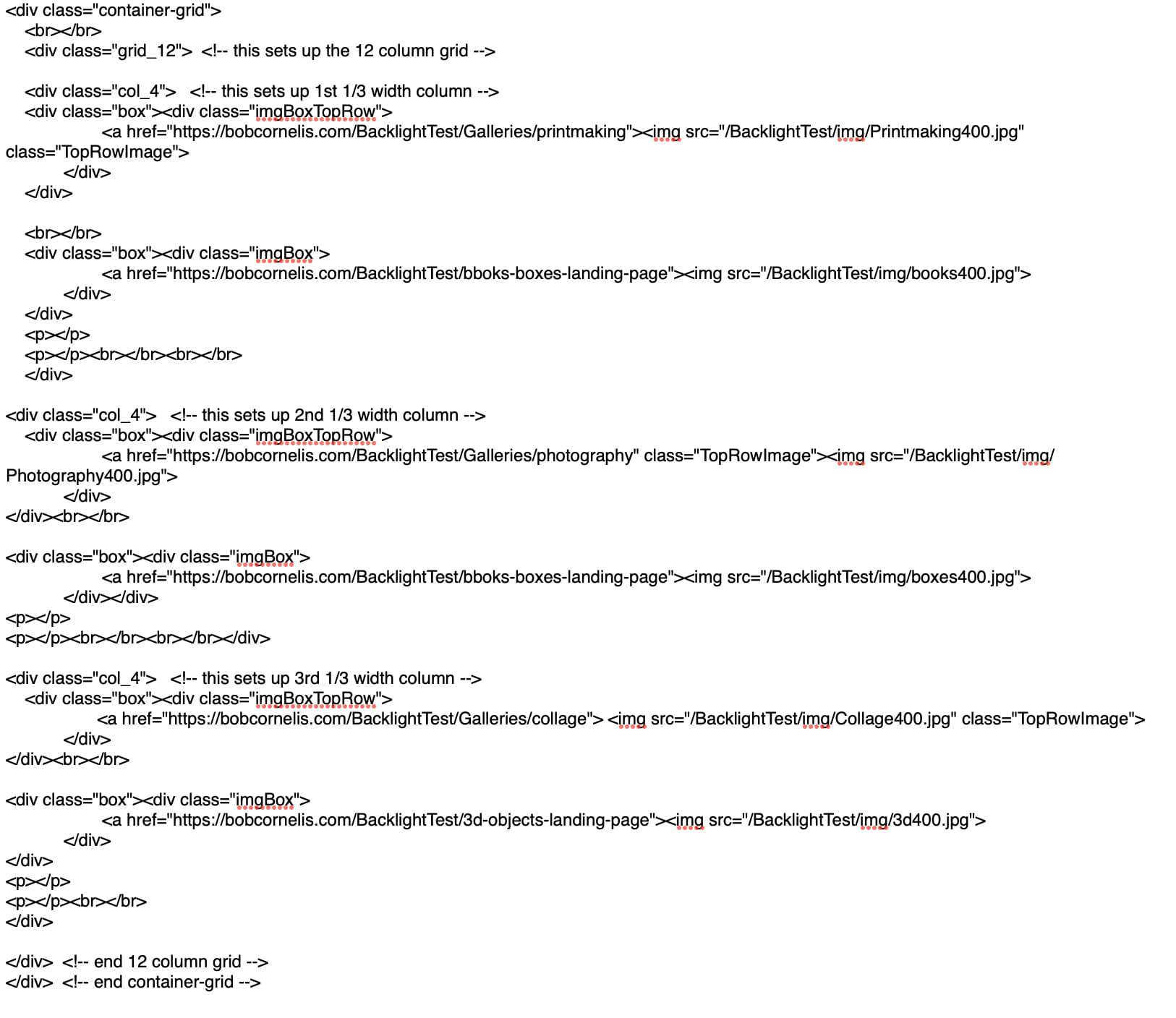
Here is the html code I’m using:
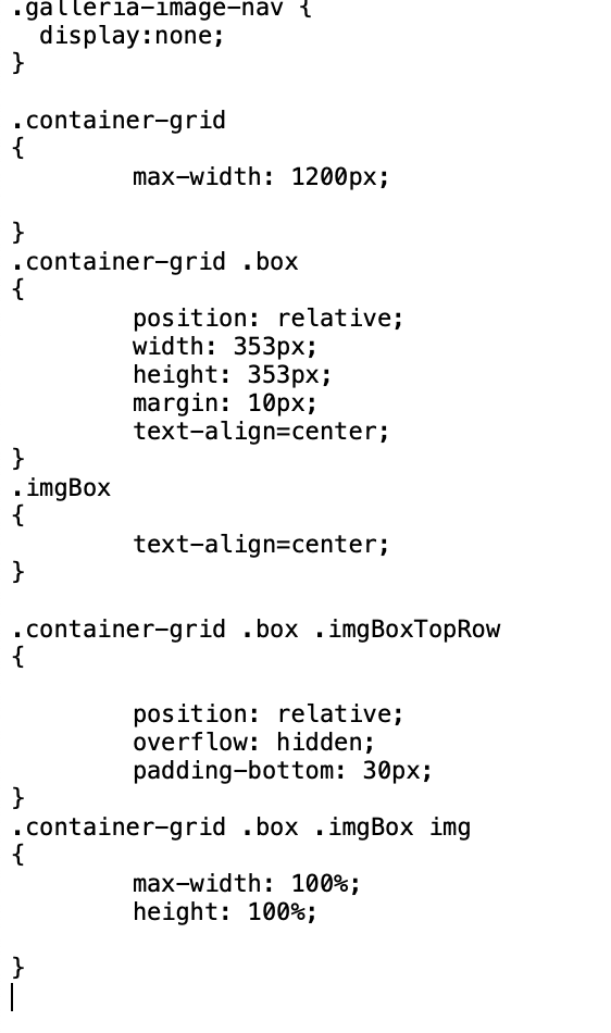
And here is the css: