Responsive sizes

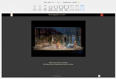
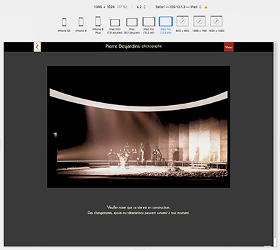
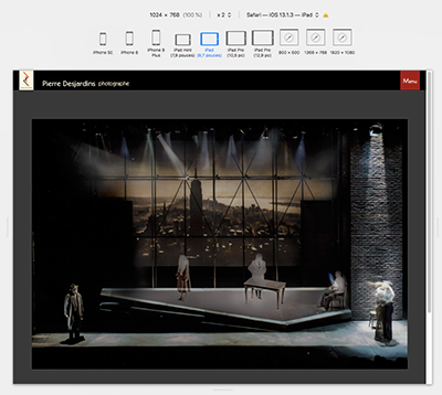
Wondering why the top pallet TITLE does not respond consistently as the viewport changes. At some sizes, it is centred while at other sizes it’s to the left.
See these examples from pideja.ca;
1920
iPad Pro iPad
The CSS used is:

/* logo + "Pierre Desjardins photographe" */ .top-pallet-logo { background-image: url("https://pideja.ca/backlight/designer/page/image/9"), url("https://pideja.ca/backlight/designer/page/image/27"); background-repeat: no-repeat, no-repeat; background-position: 150px, center; height: 48px; width: 100%; } li.top-pallet-logo a { display: block; height: 75%; width: 75%; }

Of course, these are simulations in Safari, but I guess it must display the same on the real devices.

Look to your custom css inside the media query (starts at line 271). On line 290 you’ve got a rule that sets the logo positions for your background images.

Because you have other CSS code in pideja.css that takes precedence (line 290):

@media screen and (max-width: 1024px)
.top-pallet-logo {
background-image: url(https://pideja.ca/backlight/designer/page/image/9), url(https://pideja.ca/backlight/designer/page/image/24);
background-repeat: no-repeat;
background-position: 15px, 65px;
height: 38px;
width: 100%;
}

It looks like there is an error with your font definitions as well!

look at lines 13 - 34 of your custom css. You’ve got a series of font src: ( ) / format ( ) that should probably be inside of the @font-face rule that starts on line 7.
But you close out that rule on line 11 (and then there’s a lone closing curly brace on line 34)
Try running your css through a validator like this one

Before being aware of your replies, Daniel and Rod, I changed the media query to read
@media screen and (max-width: 1920px)
This seems to place the title on the left side and centred on the mobile, as desired.
Don’t know about the font definition error. Do you mean this?

body {
font-family: KabelLTPro-Book;

}

/* custom font */

@font-face {
font-family: ‘KabelLTPro-Book’;
src: url(’/backlight/custom/fonts/webfonts/3B0CE6_0_0.eot’);
src: url(’/backlight/custom/fonts/webfonts/3B0CE6_0_0.eot?#iefix’) format(‘embedded-opentype’), url(’/backlight/custom/fonts/webfonts/3B0CE6_0_0.woff2’) format(‘woff2’), url(’/backlight/custom/fonts/webfonts/3B0CE6_0_0.woff’) format(‘woff’), url(’/backlight/custom/fonts/webfonts/3B0CE6_0_0.ttf’) format(‘truetype’);
}

All the text looks like it’s in Kabel to me.

Somehow, I think this media query “fix” is not legit. All it does is leave the title on the left on all sizes.

look just below that. If you want all that other stuff to apply, you need to remove the curly brace on line 11:

@font-face {
    font-family: 'KabelLTPro-Book';
    src: url('/backlight/custom/fonts/webfonts/3B0CE6_0_0.eot');
    src: url('/backlight/custom/fonts/webfonts/3B0CE6_0_0.eot?#iefix') format('embedded-opentype'), url('/backlight/custom/fonts/webfonts/3B0CE6_0_0.woff2') format('woff2'), url('/backlight/custom/fonts/webfonts/3B0CE6_0_0.woff') format('woff'), url('/backlight/custom/fonts/webfonts/3B0CE6_0_0.ttf') format('truetype');
}

src: url('/backlight/custom/fonts/KabelLTPro-Book.eot');

/* IE9 Compat Modes */

src: url('/backlight/custom/fonts/KabelLTPro-Book.eot?#iefix') format('embedded-opentype'),

/* IE6-IE8 */

url('/backlight/custom/fonts/KabelLTPro-Book-Regular.woff') format('woff'),

/* Modern Browsers */

url('/backlight/custom/fonts/KabelLTPro-Book-Regular.ttf') format('truetype'),

/* Safari, Android, iOS */

url('/backlight/custom/fonts/KabelLTPro-Book-Regular.svg#svgFontName') format('svg');

/* Legacy iOS */


}
'''

You’ve just told it to apply the css to browser windows that are 1920px wide or less. That’s most monitors.

I don’t quite understand, about the font definitions. Would I be better off just keeping the first 11 lines and dump the rest (12 thru 33)?
Especially since I already have the Google font statement for the Kabel in Backlight.

It depends on if you need all those extra definitions. Right not they’re not being applied because they are outside of the rule you created.

If Kabel is a Google Font, then your css is superfluous and you don’t need to add the assets in backlight/custom/fonts. You only need to do that if you’re using other fonts you’ve purchased elsewhere.

This fonts conversation is getting off the original topic (our fault for bring it up). If there are other font issues, lets put them in their own topic.

You are right, of course. As a test, I commented out all that CSS code regarding the font and left that management to Backlight. Nothing happened, witch is good, in this case.

@Pideja IMO, you should comment-out your custom CSS and see whether the logo behaves in the desired way by Backlight’s own styling. If not, then reapply the desired custom rules. It seems you’ve coded yourself into some conflicts, and I think that taking a step back might help you to minimize your changes, and organize your code.

Or another technique would be to create a blank stylesheet, and reassign your template to use it. Then evaluate the areas you’ve changed, and then copy and modify pieces of your custom styling into the file as necessary. I often find the best success when taking this incremental approach to reevaluating my work.

1 Like

Great idea! Proceed systematically…why didn’t I think of that?
Thanks Matthew