Hi Paul,
Ineed your help once again.
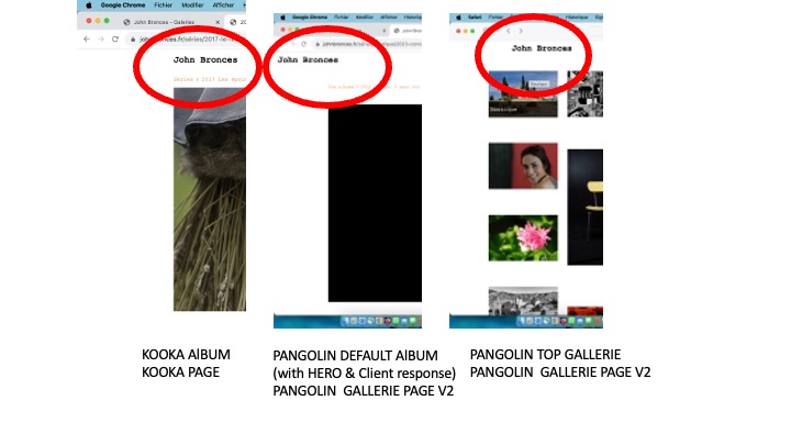
I use different page templates, because not all functions are available with KOOKA.
In the captured images (below) you can notice the different positioning of “John Bronces”, while the TOP LEVEL GALLERIE, and ALBUM uses the same page template.( of course I have cleaned the diffrent navigators & TG caches).
Why ? Where is it possible to adjust the positioning of this header? Thank’s
Your masthead looks like it’s in the top pallet (Pangolin) or Running Head (Kookaburra).
Make sure that the widths of those sections match the width of the page. There are also padding settings in the Pangolin Top-Pallet.
There are also settings in the Pangolin album template that control the width of the album as well as the “gutters” (padding, I believe) that can affect look.
It would help if you included links to the pages you’ve shown (including links always helps in diagnosing problems)
Pangolin appears to have the Breakpoint set to Always. This leaves the mobile menu icon on at all times. Your top pallet width is set to a large number. That’s why your site title is way over on the left and the mobile menu is way over on the right
You can control the width of the Pangolin Top-Pallet using the Max-width setting in the Pangolin page template under Top Pallet. This will move your page title and mobile menu so that they can align with the page content. Try setting the Top Pallet width to match the setting in the Layout section.
Your Kookaburra albums are using a different set up. For one, the mobile menu is not in use. If you want a similar look as you have in the Pangolin templates (with the mobile menu on the right), then in the Navigation section, set the Breakpoint to Always.
Otherwise, consider reducing the font size for the navigation. Right now it’s set to 37px and that’s just too big for the page design.
Thank’s a lot. It’s seams better.
How to place the menu icon at the right but a little beat at the left ?
Unless I’ve missed something, the only way I can think of to move it only a little bit is by using custom css.
See if this does it:
.page__toggle__buttons li {
margin-right: 60px;
}
It d’nt work. Don’t worry. You have to stop, otherwise you risk addiction! 
it might need to be more specific
Hi Rod, this was helpful, but I have an additional question.
Is there any way to put the menu in the top pallet in the Vertical mode? On my landing page, it. Doesn’t show when the Horizontal mode is switched on. I would like it to be present, but not shift the page to the left when open? I’m using Pangolin to experiment with a background image for the home page. I don’t think the background pic works using Kooka?
Not sure I’m following. You currently are using the mobile menu for all device widths (Breakpoint set to Always).
But you want the menu to be in the top pallet on mobile devices in portrait mode?
Sorry for the confusion, and thanks for your help. The only way the menu shows up for me on the landing page is when I use the “Vertical Navigation,” which forces the use of a pallet. The “Horizontal Navigation” for the menu items is not functional. At least I don’t seem to be able to make it active.
My question is: Do you know of a way to make the “Vertical Navigation” active in the top Pallet? Or do you have suggestions for why I don’t see a menu in the top Pallet? I hope that’s a bit clearer?
Thank you again for looking at my issues
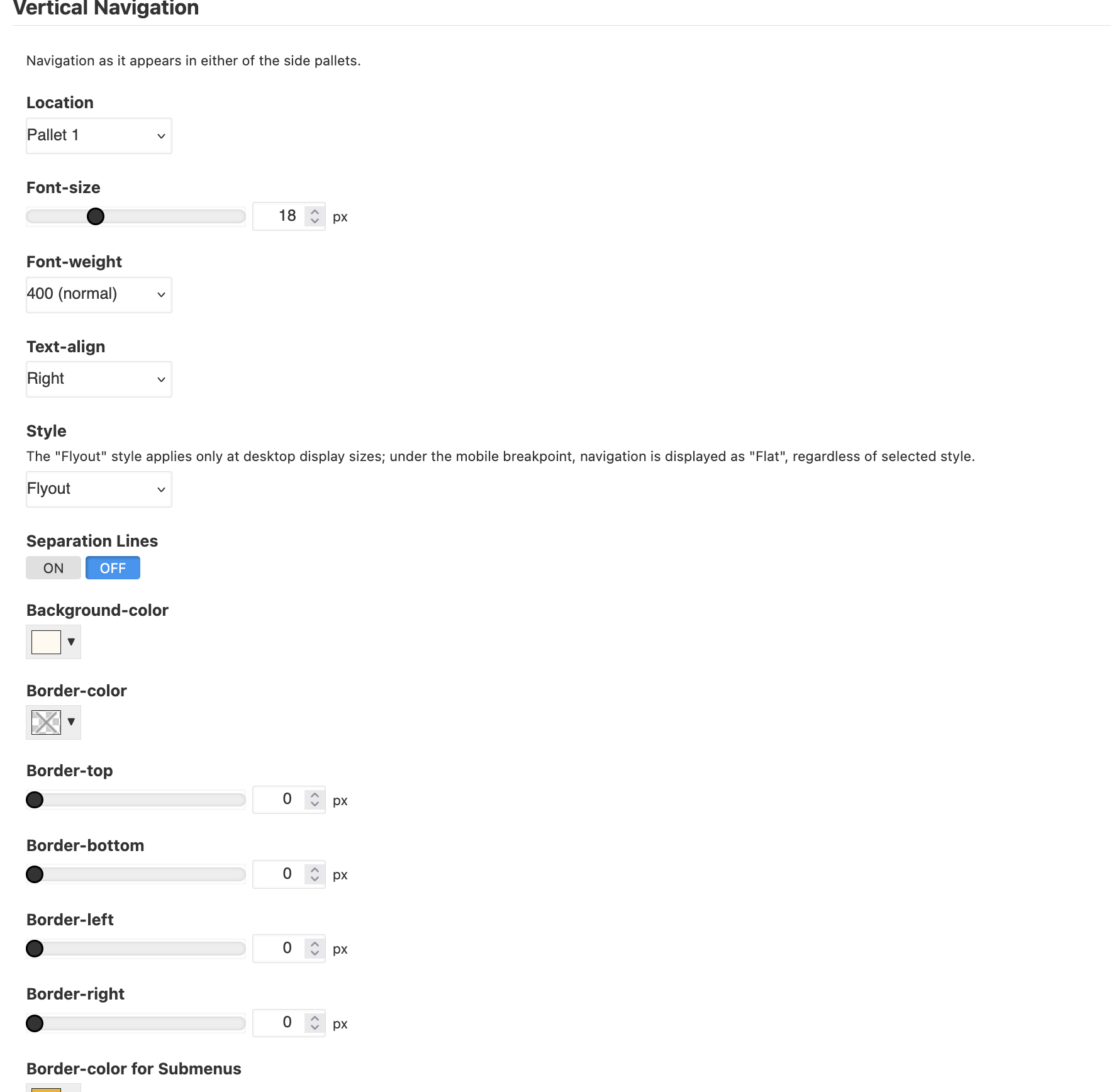
Here’s a screen shot of my design page for the menu template
Vertical Navigation can only be in the side pallets.
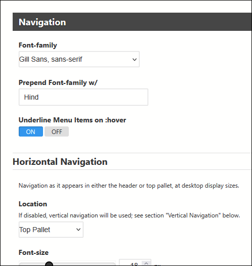
You can place horizontal navigation in the Top Pallet; that’s what I’ve done for my site:
Set that in the Navigation section of your page template:
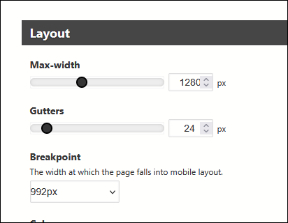
You’ll need to set a Breakpoint in the Layout section that will allow the horizontal navigation to show:
This allows the horizontal navigation to appear on an iPad in portrait mode and wider. Below 992px, the mobile menu takes over.
Ahh, so many options! Why I love this program and why I get frustrated with it at the same time.  Once again, you came to the rescue. Can’t thank you enough. Happy Holidays to all in the Backlight Community.
1 Like