EDIT: This question now answered and to stop confusing myself the demonstration album linked below has been removed
I’m creating a design which I’m mostly happy with. This Front Page - David Gordon page gives an idea of what I want. What this page is missing is the footer, which has been pushed down by some white space. Scroll to see! Other pages and galleries I’ve created such as Contact - David Gordon look the way I want and expect.
But now the whole page has moved left. The menu and pallet 01 are now too far over. The menu is fine but I really want a bit of breathing space for the pallet contents.
So, how to keep the page aligned (more central) as in Front Page - David Gordon while seeing the footer as in other pages?
the reason the footer is being pushed down is due to the aspect ratio (1:1) for the container of the Galleria slide show.
Try changing that to X:3, Y:2
I’ve added a couple of verticals and that all works fine, thanks @rod_barbee.
I’ve also had a look at changing the aspect ratio for the for mobile but I’m not sure if that’s doing anything for me. Or maybe I need to look / learn more about the viewport width. The slideshow looks fine on an iPhone held upright, but holding it ‘landscape’ in the hope of see the pictures fill the screen results in them being shown oversized so you need to scroll to see more of the picture. Maybe on for another day as I concentrate on the desktop presentation.
Also for another day or question, can I get my pallet 01 text (currently on the left below my menu) to display beneath the slide show?
Thanks again.
EDIT: I see if I view ‘fullscreen’ on an iPhone the images stay withing the slideshow area. But visitors need to know that and wouldn’t!
It depends on how you want it seen. If you want the text to appear below the slideshow for both desktop and mobile, you can simply move it into the album or album template copy area.
If you want it in the pallet for desktop but in the main copy on mobile, that would require some customization. If that’s the case, could you post that in the Backlight Customization section of the forum?
Yes! So, to confuse things further I’m trying with a horizontal menu as I’ve worked out how to keep it visible when scrolling down.
That said, I can see my text now I’ve added it to the album. But its only visible on the thumbnail page, not a full view so not on my ‘front page’ auto slide show.
Now I’m pretty sure I can do this as I’ve see it done here Home - Rod Barbee Photography ! You have a slide show running with text below. What’e the secret?! Much customisation?
On my home page I’ve inserted a Theater Vegas slide show.
For the text, that’s in the page’s copy area and I used the TTG Responsive Grid to lay it out.
I’m still trying to get my head around where different setting live, some are in the page template but when I go and look turns out they are somewhere else…
Before I go and buy the Theatre plugin to get the Vegas slide show which will do what I want (I think!) is it possible to have text below my slide show at Front Page - David Gordon without it?
That page uses my ‘DG Pangolin Galleria Front Page’ album template which has my text in ‘main copy’ selected to show below the gallery. And I’m guessing ‘gallery’ means the thumbnails as I can see it on Album One - David Gordon
The responsive grid also looks interesting, thanks for that link.
I just liked the controls of the Vegas slide show. You should be able to do what you want with Galleria.
In the page, under Insert Album, just choose where you want the album in relation to the text (above or below)
In general, I would advise not getting too hung up on how the shape of your content pushes your page footer beneath the fold. Displays come in all shapes, sizes and orientations, and when you start messing with the aspect ratio of a slideshow to ensure it doesn’t push the footer off-screen on your display, you’re only solving for your display, and not for anyone else’s.
Even if another person has your exact same laptop, they might have their browser window occupying half the screen, instead of the full screen. Or they might have moved the browser window to an external display. And so on …
You already have the Galleria show inserted in your page. Just add the text to the page content.
In the test page you linked to above, I have the page copy set to be above the slide show (Galleria) and the content below the slideshow was entered in the page copy area but was moved using jQuery.
Yes, thanks, I know! What I want to achieve here, on the ‘home’ page is a clear definition, a frame for the content. I’m trying to subconsciously say, this is the foot of the page, there’s nothing more to see here. For other pages I’d be happy for the footer to be below the fold.
I seem to have been able to create a page where the image automatically resizes to the available browser window. Again, that’s what I’m looking for because I know everyone has a different browser or setting. I’m happy enough other than some tweaking that the page (as of 0900 BST on 01-09-25!) resizes well. The footer remains at the foot until the width becomes useful only for mobile devices. That’s fine.
No, I need a slideshow and links. I’m afraid I dislike fullscreen images or slideshows as I get lost. The navigation disappears, there’s a selection of icons - which vary depending on who’s site you are visiting - which I have to guess as to what they do. I want to KISS, a picture on a page where I can see how to get to the next or last one. Where I can see how to return to the overview or gallery list. Full screen menu-less pages don’t work for me. And I’ve watched people use my website, I know they need things spelled out and easy to use. They don’t have time to get lost.
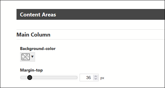
You could reduce the top-margin in the page template, but that won’t necessarily enlarge the image.
Image appearance size depends on the aspect ratio of the slide show and the image size. It looks like the aspect ratio is around 16x9. And the image size is restricted to 666px in height.
Thanks once again. I think I should stop here. I’ve returned to a vertical menus style as that seems to cause me less difficulty for now.
I’ve set the top margins so the picture ahd masthead are aligned. The images settings were already at 2048 x 2048px with a 3:2 ratio. But you may be correct as I still get lost as I move from one setting to another…
There is still a larger white space between the bottom of the image and the text than I’d prefer. I’ll come back to that some other time.