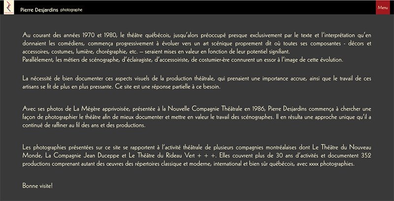
Added an “About” page to my site (https://pideja.ca/about/ and I want the copy to have larger margins than what is seen now.
Tried to edit the css file by adding: .body {
background-color: #000;
margin-left: 50px;
margin-right: 50px;
}
Here is an example of what I’m looking for:
there is no .body class. There is a body element.
But if you want to target the text, then try targeting the .the__copy selector.
And I think padding might work best.
The problem is that you use that selector in two other places already and there are conflicting padding settings.
If you only want this padding on the About page, then use the .slug-about body class to target only the about page.
.slug-about .the__copy {
    background-color: #000;
    padding-left: 50px;
    padding-right: 50px;
}
Another option is to just write it in html and put it all in div and use a custom class or inline styling to control the appearance.
Or you can create a page template that already uses the left/right padding you need.
Since the “About” page is based on the main Pages-pideja template, could I adjust the margins on the Pages-pideja template?
Since there seem to be three “.the__copy” selectors, do they all attempt to control the same area of the page? In other words, could I consolidate all three into one?
In fact I put the padding instructions in all three to no avail.
They why not just use the max-width control the for content area in the template? You might need for fork your template and have one specifically for your about page. But that’s sort of the point of the designer. Once again, I think you’re overreaching for code, when the designer could accomplish this more safely. For example, you make some big margins in CSS, but then you’re also going to have them on mobile, which would squash your text, unless you write still more code to implement media queries, and then you’ll probably have some further conflict 6 months later.
OK, so I tried to use the max-width control with sizes ranging from the minimum (920px) to 1440 px. No change.
But, checking with different browsers yields altogether different results! On Opera and Firefox, I get a black background! On Safari, the Home page has two different grey backgrounds and the About page is non-formatted black text on white. Only Chrome shows the design as intended. All hell is breaking loose!
What do you mean by…
fork your template?
Clone it. Customize the cloned template specifically for your About page.
did you try clearing browser cache?
The page looks the same to me in Firefox, Opera, Chrome and Edge
Cleared all caches. Now look the same but text is on a black box on the grey page background. Started the day without that black box!
The black box is in your code.
Yep, I just grabbed that from Pierre’s code at the top.
Pierre, if you don’t want the black box, then just remove it from the css. Easier still may be in doing what Matt suggested: create a page template just for the About page. That would keep css rules from competing with each other.
In the process of creating a template for the “About” page. Meanwhile, seeing Rod’s reply, I corrected the text background and adjusted the padding all around.
Still don’t know what to do with the two other .the__copy code sections. Should I merge or delete one of them? I guess I’ll have to try to find out.
'Till then, thanks again Matt and Rod.
First identify what they do. Do you still need those rules?
the rule starting on line 61 conflicts with the rule starting on line 106. Remember, if you use the exact same selector for different rules, the last rule is the one that take precedence.
For any properties common to both rules, the values in the last rule will override the first, making those same property/value combinations in the first rule essentially useless.
You have a tendency to write more custom code than you should. You’re using Backlight for its features, presumably, so use its features. I’ve put a lot of effort into building guardrails around the Designer settings. So if you make the change in designer, then you ideally shouldn’t be able to break your design. No such guardrails when you make your own code. And I promise you, you’re going to regret the custom padding when you view the page on mobile; it will then take more custom code to fix the custom code you already wrote, and if you don’t understand the code you have, you’re going to struggle to fix it without creating still more problems.
Use the Designer. If you’re having to inspect conditional classes like, “.slug-about” to implement a change only on that page, then you probably should be creating a template for that page instead of writing code.
You are right, of course. I’ll be creating an extra template for the “About” page. In the meantime, I deleted that extra .the__copy code to no ill effect, as far as I can see.
Only, the font used on the mobile has changed to some kind of sans-serif like Helvetica.
But, this is another topic and I’ll be posting it on another instance.
