Heya all,
I am trying to dive into BL again and I just updated my BL2 install.
I am trying to adjust the thumbnail size of my Default Album and I can’t get it to work! I might be overlooking something very simple as the thumbnails just stay the same size.
This is what I have done:
And it doesn’t show? Thumbnails remain super small!
What am I doing wrong?
Adventurous greetings, Coen.
Sample page: https://photocoen.com/publications/collo-ritti/
BTW @Matthew the Hero header in BL3 looks awesome! I think I need to update 
1 Like
Coen, great to see you here! I’ve missed you guys, and I hope the Covid situation hasn’t utterly ruined your travels.
You’ll need to change the thumbnails renditions width and height, then re-upload any images to generate new thumbnails. Beyond that, you might have some layout settings you’ll need to adjust – the image files will be larger, but then template might still be putting them into a smaller box.
 we are champions in adapting… -> a quick and dirty update is online now:
But OT:
I did upload new images in a new album, so I’m guessing it is generating nice big thumbnails. But I can’t understand what else I need to set in order to show them on the grid?
I see it works when I switch “Gallery Style” to Justified… But it doesn’t work if I switch to Masonry (which has my preference).
Any idea how to get this working?
I believe this should solve it for you:
- Edit the template.
- Access the Thumbnail Grid group of controls
- Size of thumbnails are then controlled via a combination of:
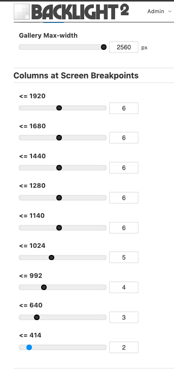
- Gallery Max-width slider
- sliders under Columns at Screen Breakpoints
Beautiful images in that post. It’s all so green! Please pass my affection along to Karin.
Okay I have the following (should be standard), But I don’t understand the logic behind the columns numbers and what it does to the small thumbnails. Where do I start sliding them?
Okay I just dialed in some random smaller numbers, and I think I got it working!
1 Like
So, when the browser window is wide – at least 1025px or larger on the x-axis – then you will be displaying images in six columns. So the thumbnail cells will be (100/6)% of the available width.
Let’s say your viewport (or your layout) has a max-width of 1140px. Then your thumbnail cells will be only 190px wide; the thumbnail images will then be (190 - padding - borders), so … small.
So you can increase the size of the images by:
- reducing the margin between cells
- reducing the border around cells
- reducing the padding within cells
- decreasing the number of columns displayed at a given breakpoint
By using the Columns at Screen Breakpoints sliders, you can set different numbers of columns to be displayed on desktop wide-screens, laptop displays, tablets in landscape or portrait orientation, on mobiles, etc. based on the width of the display.
For example:
<= 1024: 5
… displays images in five columns on an iPad held in landscape orientation
<= 992: 4
… then will display images in only four columns when that iPad is rotated to portrait orientation.
Taken together, these two settings can be understood as:
When the display is between 993 and 1024 pixels wide, display five columns. When 992 pixels or narrower, display four columns (until the next breakpoint).
Great! Got it! Looks simple and neat now!
Now the only way to get a Hero Header up there is to upgrade… Right? 
1 Like
Or write one in with html in the page copy.
Any idea how to get one of the images up there as an Hero Image?
Can you point me in the right direction as to where to source HTML code like that?
here’s a tutorial I wrote on adding inline images to your page copy:
Yeah, the Hero Images were added as a feature in Backlight 3.
Thanks. I will look into it… While I’m reading I have some other nice ideas. Thanks for sparking this off.

 we are champions in adapting… -> a quick and dirty update is online now: