pideja.ca
Not too sure if it’s a good idea, but I’m trying to simplify the design of my pages but having a hard time with three things:
the name plate in the masthead has a black background. I’d like to change that and probably the whole text/background.But, I can’t find it in the inspector at all;
on the “About” page (https://pideja.ca/about/), you’ll notice an area that’s not the same grey as the rest of the page (#4f4f4f). Again, I’ve been thru everything and I fail to correct that darker “frame” area;
I’d like to remove the logo on the left side, or at least align it correctly, as the menu button is.
It’s been years sing I last tinkered with the design of this site, no I lost some of my bearings …
This would indicate that the logo (left) and my nameplate are on the same line, sort of linked together. Is there a way to disassociate these two elements? I could then manage these two elements independently and change the name plate and better align the logo, or just remove it.
I found a way to remove the black top bar, change the name plate, and make the whole page the same color. So, goes simplifying for now. But I still have that pesky text box that’s too narrow on the mobile. Looking at the CSS but still in the dark…
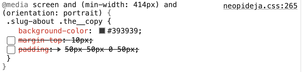
In your custom css (starting at around line 30) you’re applying a lot of padding left and right to the copy area of the about page.
You should put that css in a media query affecting only larger devices
Well, I’ve tried a lot of variations, the last one being redefining the @media conditions:
@media only screen and (min-device-width: 320px) and (max-device-width: 480px)
It seems to go pretty well in the landscape view but in the portrait view, the text is now in aligned left mode but still all bunched up in the middle of the page.
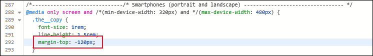
I’m now using this css:
@media only screen and (min-device-width: 320px) and (max-device-width: 480px) {
Did you address the custom css I pointed out above? It applies 70px of left and right padding no matter the device width. If you don’t want the text to be squeezed on smaller devices, put your css in a media query that will apply it only to larger screen widths
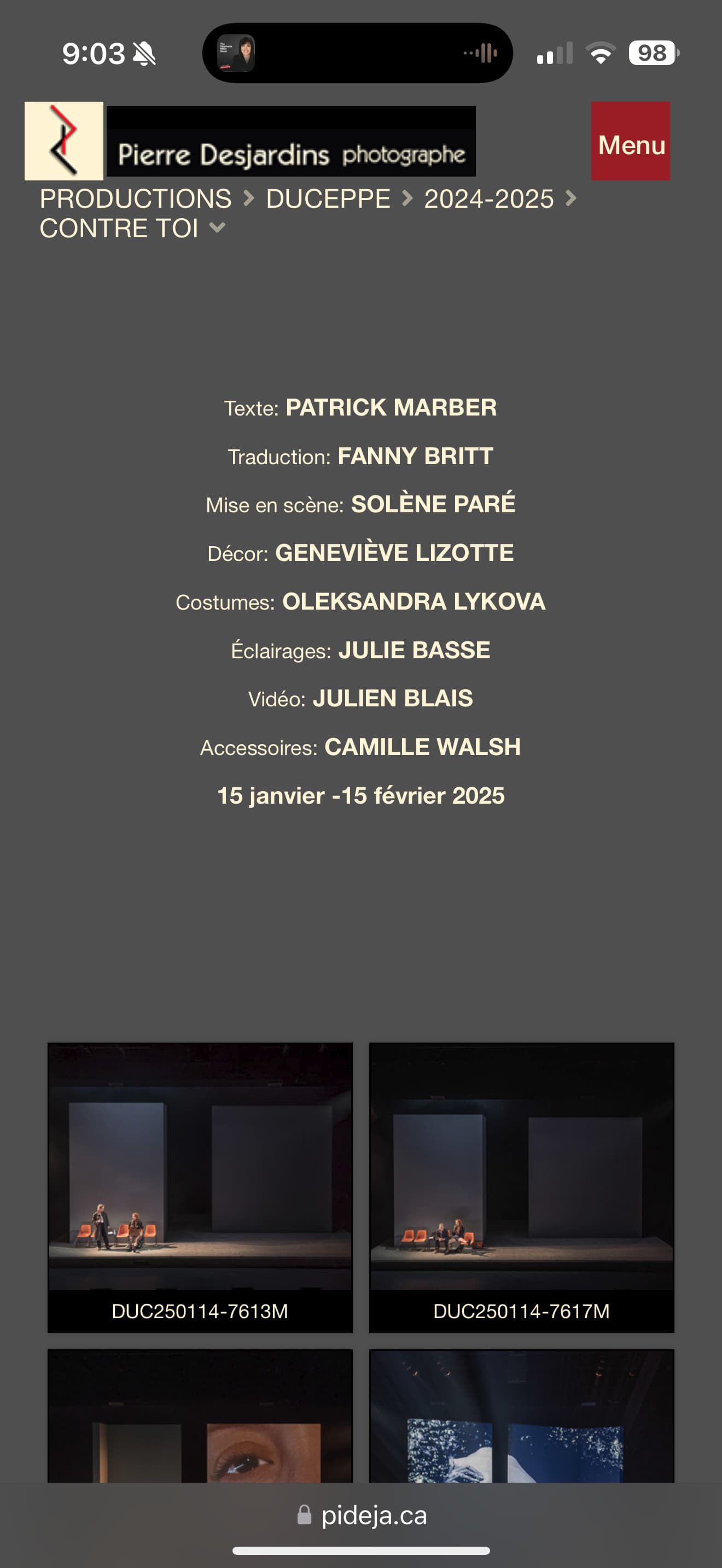
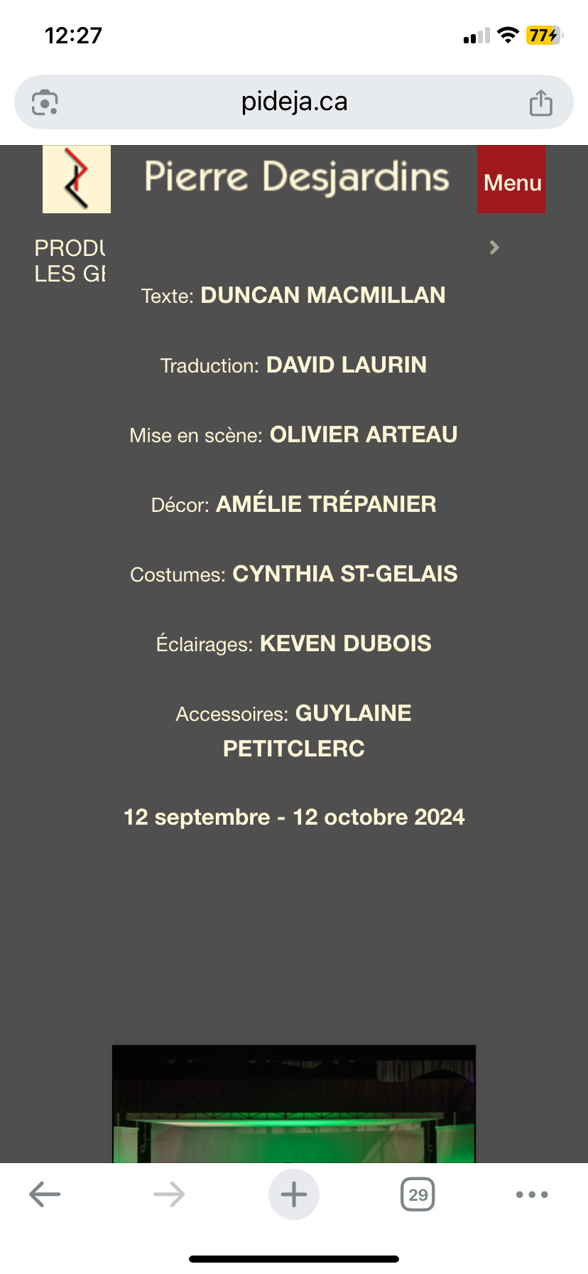
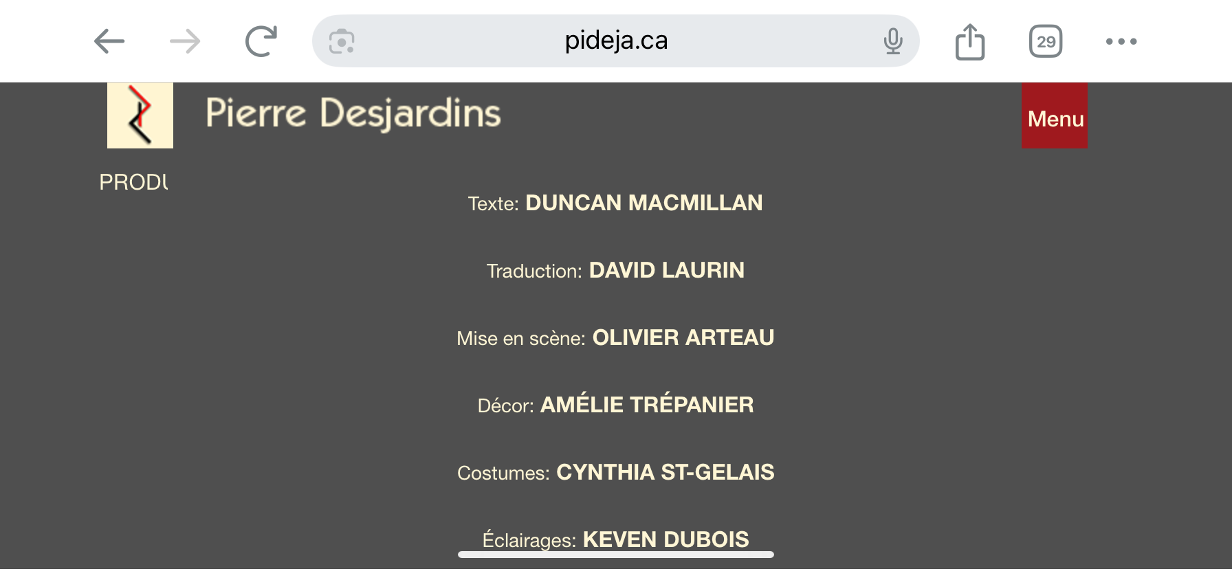
I am back at it… Although most of the pages look good on the monitor, on the mobile one of the pages looks quite different in portrait or landscape. I’ve written a media queries to attempt to address this, to no avail. On the PRODUCTIONS page, the large image display should contain a credits section that is centred on the page. But, below 1060px on the workstation monitor and on the mobile phone, the credits are way to the right!
Using the inspector, I located (I think) the corresponding css code:
You may have an older version of my site. Notice the black background in the masthead is gone and my name is to the left, while centered on the mobile.