I thought I had sorted out my menu drop down problems because the site now works as I want on my desktop. Thought I should check on iphone/ipad now as well before doing much more and found a couple of serious glitches there. I’m not sure how to even try to tackle those because mobile-specific behavior doesn’t appear to be configurable much in Backlight.
Problems appear on iphone, on ipad in vertical orientation and even on desktop if I make browser window so small it kicks into mobile design mode.
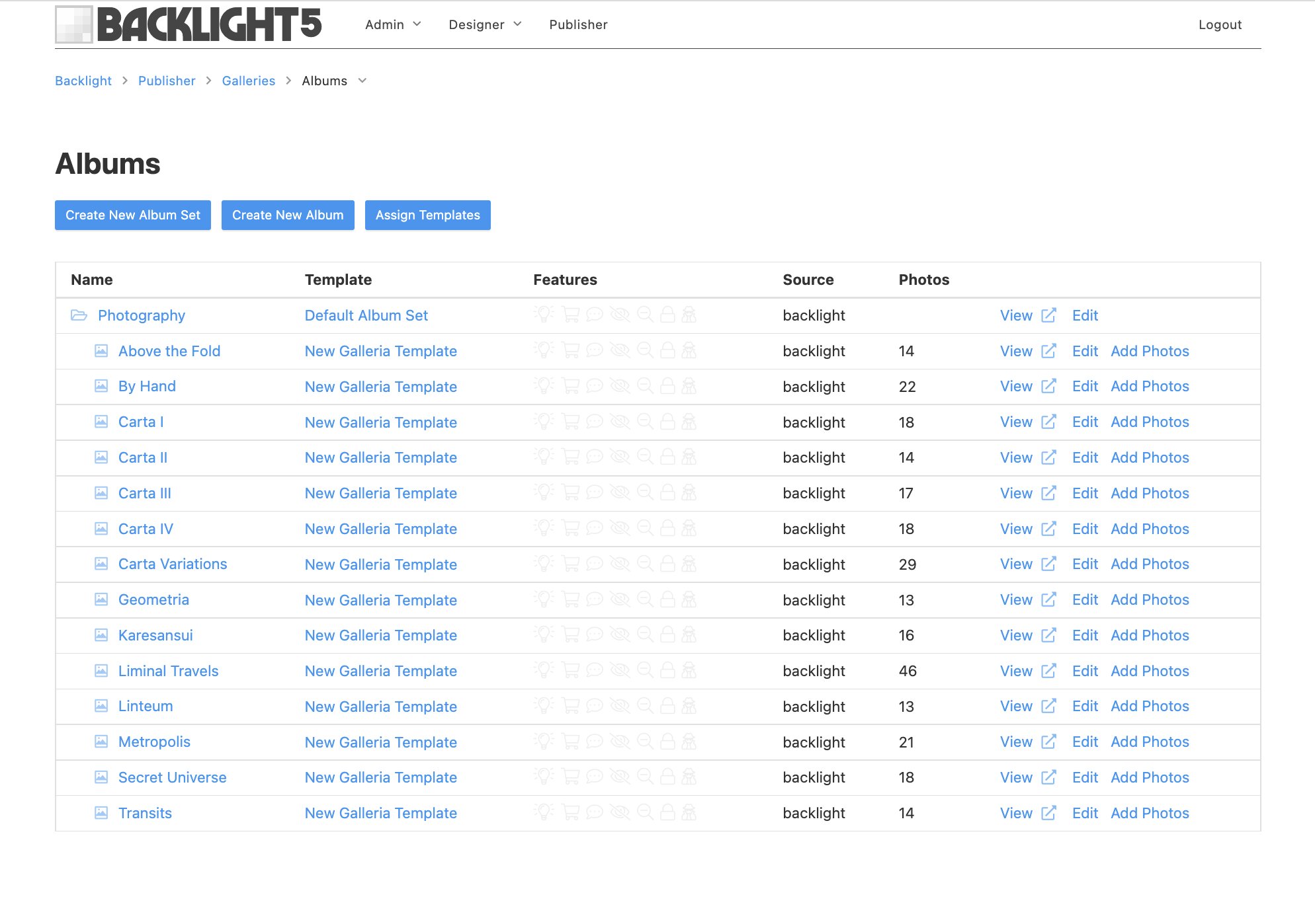
First problem is the menus (I’m just working on the Photography dropdown right now). There are seven albums in dropdown. Each takes you to a 2 column landing page with a left side pallet. Landing page has links to actual Galleria album. On mobile footprint there are multiple sets of photography albums, some point to landing pages (correct) some point to albums (incorrect - how I used to do it).
Second problem is the landing pages I mentioned. In mobile footprint, the pallet (where the album links are) doesn’t appear at all and one can’t get to it. Also, the footer is now at the top of the page and the 3 bar icon for navigation has moved to the upper left corner instead of in the right.
I’m attaching screenshot of Menu Sets and Top-Level Set with my albums.
Can anyone offer any advice about how I can make changes that would affect the mobile design? Or is that out of my control?
I have resolved the menu problems (yeah!) but the landing page problems still exist (menu bars and footer out of place, missing left side pallet). So still looking for guidance about that oddity!
Second problem first. All pallet/tray content will, by default, fall below the mobile navigation. This means your viewer won’t see it right away on mobile unless they go to the mobile menu and scroll down.
If you want your viewers to always see the link to the album on the landing page, you’re better off including the linked picture in the page copy using html. You can apply the alignleft class to the picture and it will float to the left of the text (text will wrap around)
On mobile devices, the image will appear above the text.
If you prefer the look you have now, with the image in one column and the text to the right, you can use the TTG Responsive Grid. I don’t think it’s covered in the documentation (it’s been around forever) but I have this:
Using the Responsive Grid, your image will appear to the left of the text on desktop browser widths (the text won’t wrap around the image). On mobile devices, the text will drop below the image. Or you can have the image drop below the text.
That footer issue is usually the result of a div or a p tag not being properly closed. Looking at the page source code I didn’t see anything jump out at me, but check any html you’ve written into copy areas and make sure all tags are properly closed.
I did see some deprecated html: the <center> tags. I doubt that’s causing the problem but you could try removing those and use inline styling instead.
Whatever the problem it, it could also be the cause of the mobile menu moving to the left. Maybe? But also check your page template settings for the pallet positioning. The browser inspector shows that it’s where it’s supposed to be.
Thanks Rod! I’ll play with the html and see if that’s the culprit. The landing page template definitely has some html in the content areas, which is the other pages do not so that is suspect right there!
Validator a great tool! Last time I wrote html, which was probably 5-6 years ago, I don’t think this existed.
Yes, I was forgetting the closing of all my <a href> tags. That fixed the footer appearing at the top of the pages. Now the validator only finds meta problems in parts of the html generated by Backlight, nothing in my code.
My one remaining problem is when the horizontal viewport gets very small, ie on my iphone or when I shrink the desktop browser window down too far. This forces the Menu icon to left instead of the right and the pallet containing the image/links vanishes. The latter is critical because that is where the links to the album are on the landing page.
I’m starting to wonder if a 2 column layout isn’t the right way to have an image and some text to the left of my Main Content area, at least if I want it to work on an iphone. Given the minimum width of a pallet is 200px, how can one of those ever show up on a phone with such a narrow viewport?
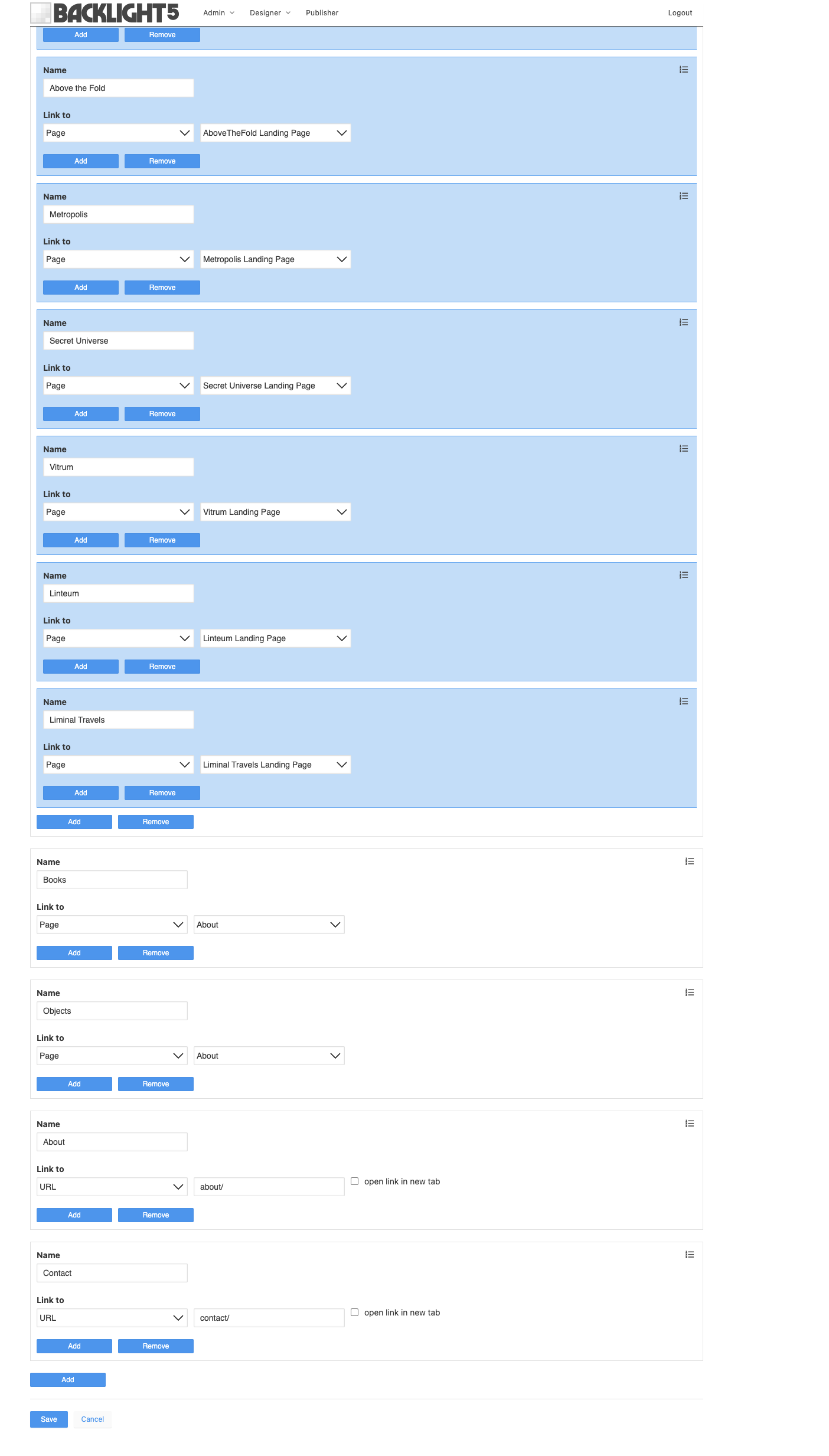
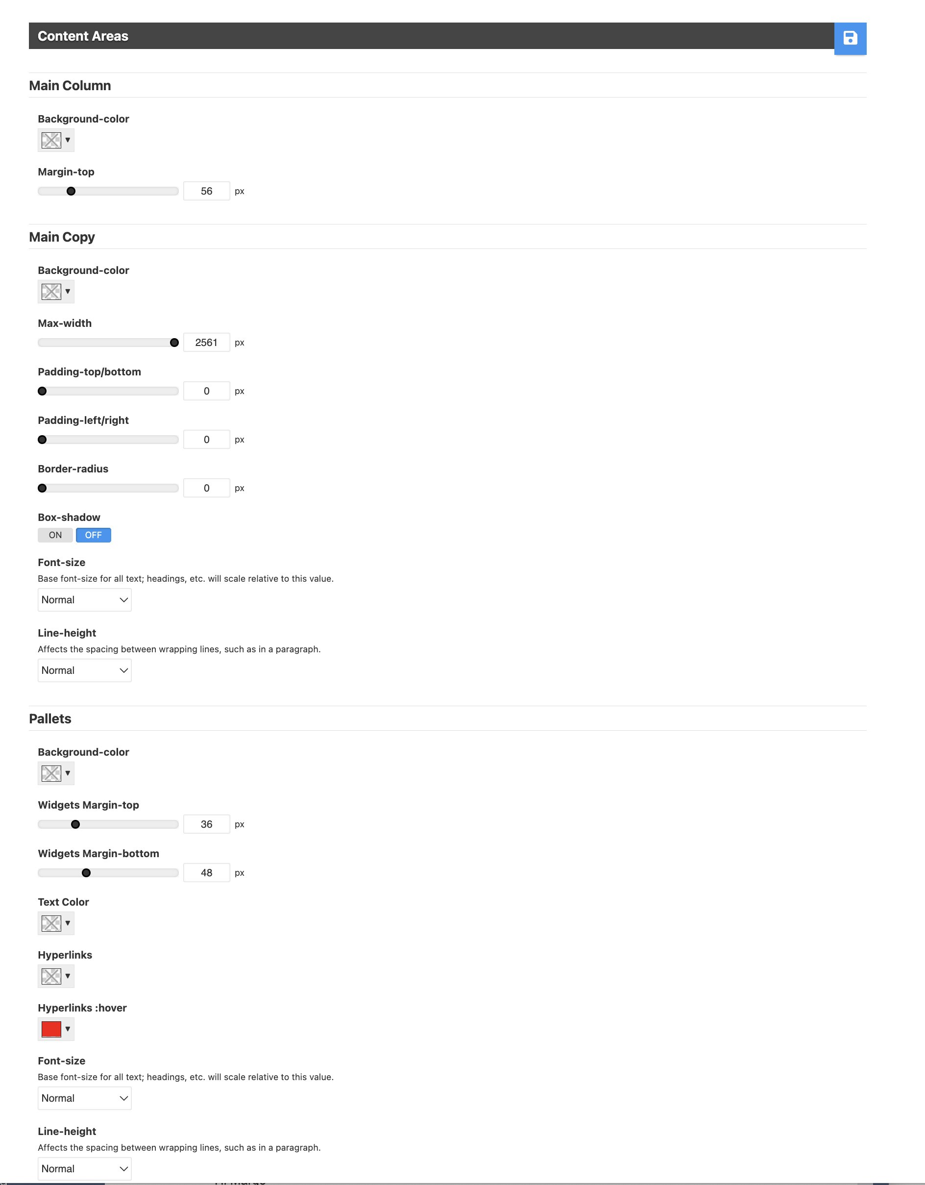
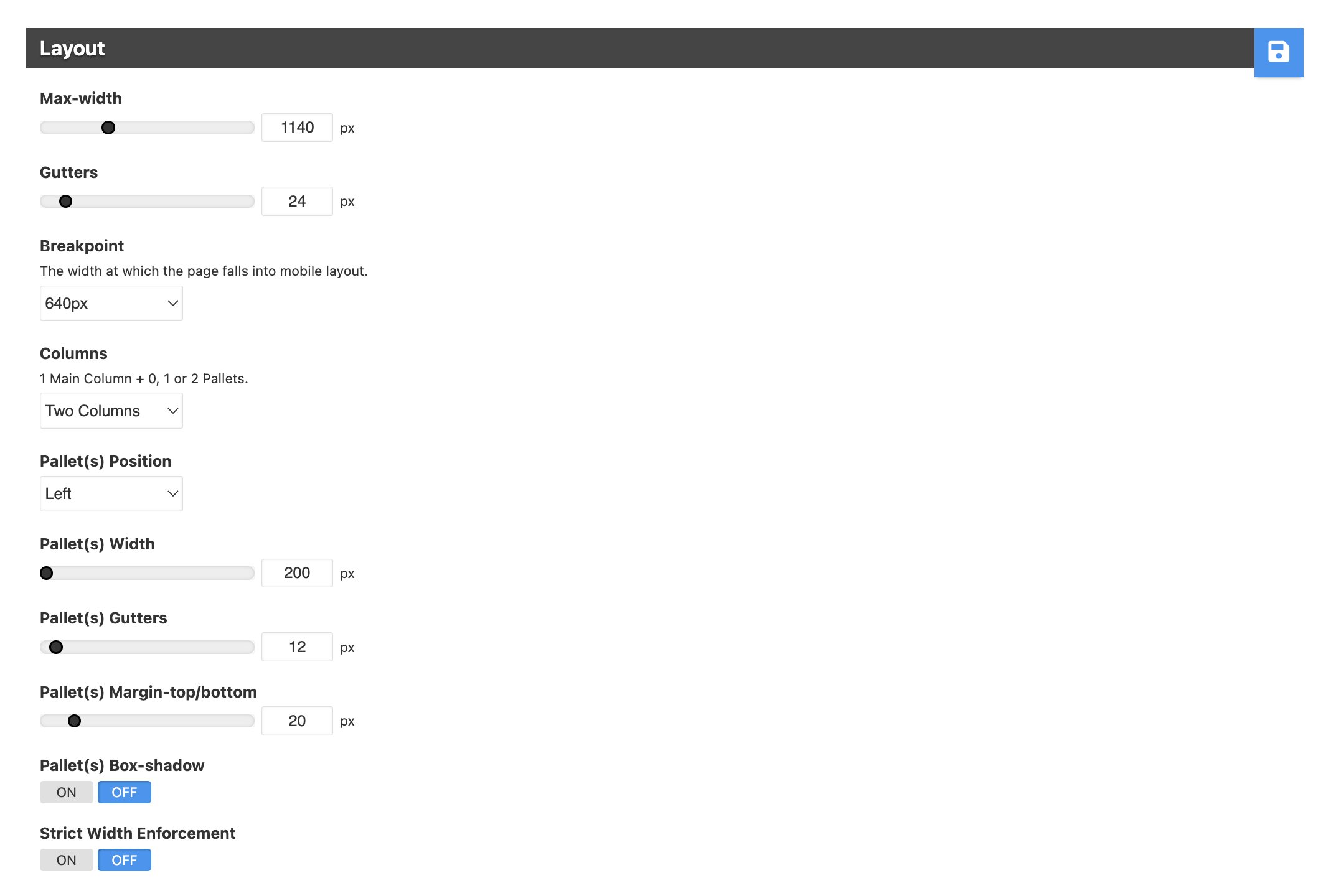
I’m attaching shots of my Layout and Content Areas of the design template for landing pages in case there is a parameter there I have set incorrectly. Also the html that is on each landing page (same structure, different content on each page).
On mobile devices, the pallet is revealed by tapping the mobile menu.
If you need that content to always be on the page whether on desktop or mobile, all the content needs to go into the main copy area as outlined in my response above.
I’m very confused about what a pallet is and what you can put in it. I thought it could contain any kind of content and could be used to create pages with general content in up to 3 columns. but now I’m inferring from this content that on a mobile device the pallets are used by the mobile menu for menu items.
So I think you are saying that I need to put the image/links on my landing pages in the main content area to force them to always be available, correct?
I guess I’m going to need to get into some CSS to structure the main content area the way I need, was hoping to avoid that! I want to turn that section into a 2 column layout. In the docs about adding custom CSS there is a recommendation to examine the “page template’s generated stylesheet” first. How do I do that?
on mobile devices, the pallet content you add is placed below the mobile menu when using two columns. (There’s a way around this using jQuery and custom css)
yes
If you want to create a two column layout, use the built in Responsive Grid. I linked to a tutorial above.
At the end of that tutorial are instructions on accessing the generated Backlight css file. That tutorial post is a little old but I think the path to the css file is still valid
Got it! Sorry I missed that comment altogether. As usual, thanks for your help on this, I at least now know how to move forward. Your patience and knowledge are impressive and invaluable to all of us trying to figure Backlight out!
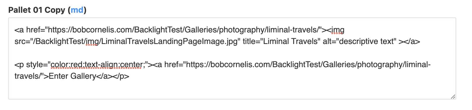
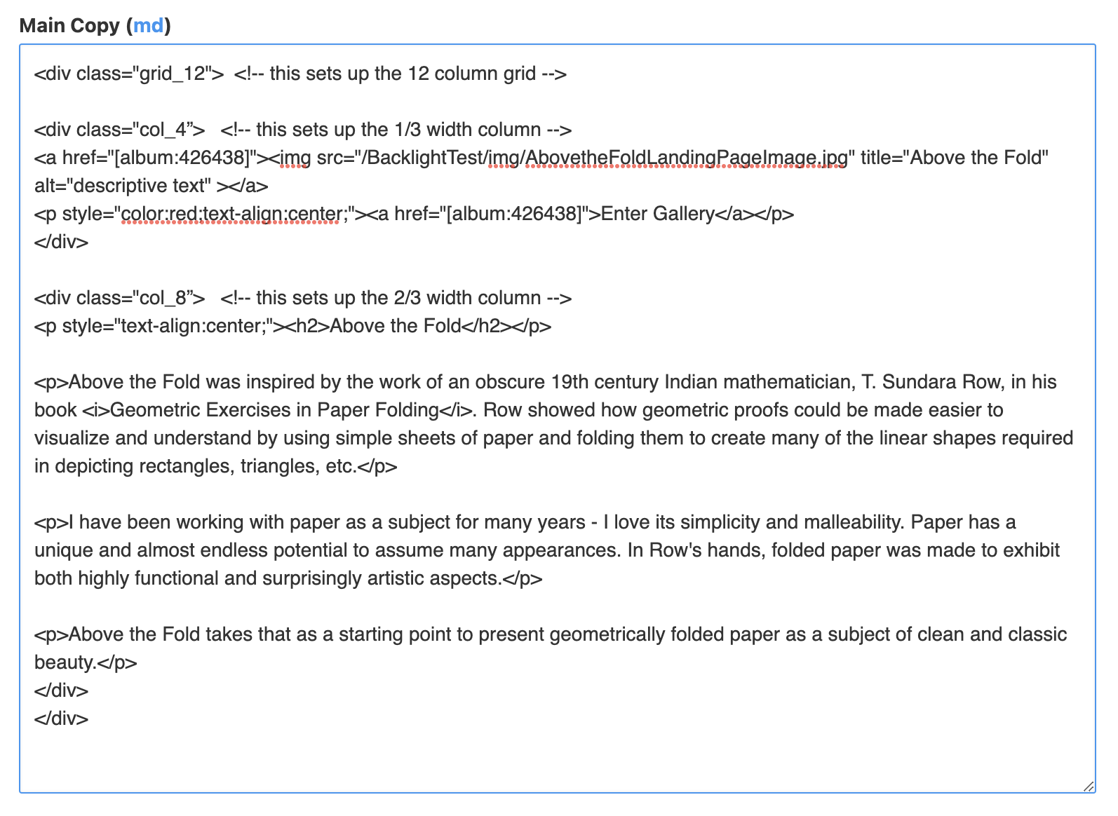
Started to try a simple 1/3 - 2/3 2 column layout by copying your initial html sample in the article and plugging in my content (as well as swapping the column sizes) inthe Main Copy part of the Landing Page design Page Copy section. It’s not working as expected so I wanted to examine the code. Here is the page I changed: https://bobcornelis.com/BacklightTest/above-the-fold/
At the end of the article you explain how to see the generated code. The latest reference is to BL 2&3 and I wasn’t sure what you meant by “access the page’s source code”. Which page are you referring to? And where do I find it?
There is, to my knowledge, no instance on the server of the landing page where I’ve added the code as pages are generated on demand and not saved (I think). Wondering if things in BL5 are different and finding the code in question requires something else.
Right. That’s an improper use of the columns. They’re different page areas, and not meant to be used for layout within a single block of text. For that, see Rod’s previous message about the grid system.
There are various ways of getting at the page’s source code and/or style sheets. You can inspect specific elements using the browser’s Elements console, or you can view the page source code in it’s entirety.
I will assume you’re using Chrome (though, I personally prefer Brave), but regardless your browser, you can always do this; just the shortcuts or locations might be different.
For the former, right click the element you want to inspect, then choose “Inspect” from the menu to open the dev console. This allows you to navigate the DOM, and you will see applying styling for the element you’ve clicked on to the right.
For the latter, you can right-click and select “View source code”. Or just press CMD-OPT-U. This will open the page’s source code in a new tab. To view the stylesheet, you can then click or CMD-click the URL to the CSS file to open that as well.
Thanks Matthew! I’m somewhat familiar with the Dev tool in Chrome, just wondered if it was better for some reason to look at something on the server.
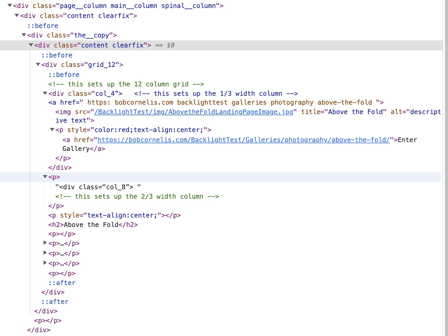
I found the relevant code on the page and it appears that a bit of my html code is getting dropped which has a cascade effect. I’m attaching a screenshot of the html I’ve added to the Landing Page Main Copy section and a shot of the code generated.
It appears to me that the at the end of the link applied to the image is missing. It’s clearly present in my code but missing in the Dev source code. Another oddity which may be a result of that is that the is a
inserted before the <div class="col_8”> code that is not in my html.
I cut and pasted the framework for the columns (all the divs) from Rod’s article and then just inserted the code that had been working when I used it in the pallet (incorrectly thinking that’s where it should go). But at least the html was working correctly, even if in the wrong place.