I want to get this website out of WordPress. I thought it might be easiest to use Backlight 5’s templated system, even though the website is not a photography/gallery site.
I started a layout in Pangolin, using a Page for the home page, but the layout has so many problems that I thought I should ask how to accomplish this before going any further.
Layout problems are:
Making the header full width and indenting both columns.
Aligning the columns - the right column is down a few pixels, and both are off centre compared with the header placement.
The copy is in Page Copy Main Copy and the right column is in Page Copy Pallet 01 Copy - should I put it somewhere else? What’s the difference between there and Copy in an Album Template?
Finally, should I use a different Type like Kookaburra or even Galleria?
You want the header image to span the width of the page?
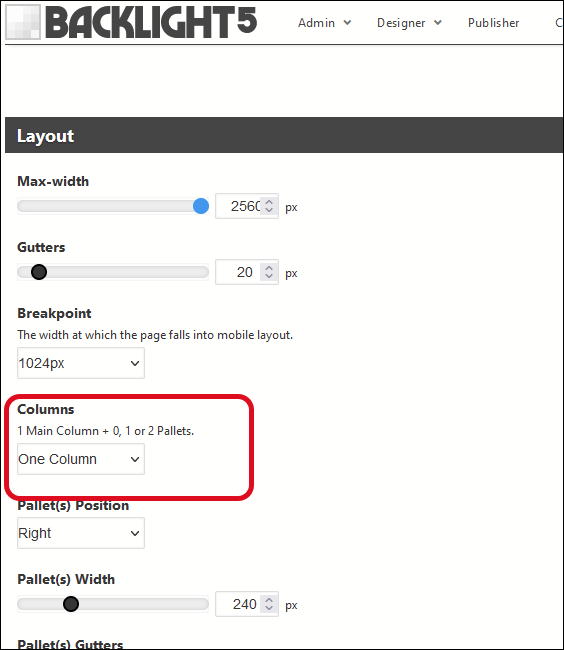
As far as the page layout, if the information in the right column always needs to be on the page, then I wouldn’t use the pallet since on mobile devices, your viewers will need to know to tap the mobile menu button to see what you have.
Instead, I’d suggest using the Responsive Grid layout for your text:
Copy in an album template (or album set template) will appear in all albums (or album sets) using that template. Copy in a page (or album or album set) copy area will appear only in that page or album or album set
Guess that depends on what you’re after. If you need a Galleria slideshow on the page, then use Galleria.
The Responsive Grid mentioned above works in any copy area. (you need to enable it in Kookaburra in the page template under Advanced Setup > Grid Framework)
in the Layout section of the template, set Max-Width to the highest setting.
To control the width of the content (text), go to the Content area of the template.
That’s great - Matt built his own Bootstrap. I’ll read through it and give it a try, although the link on that page: “For a more thorough overview, see this post” goes to a page that says right at the top that the grid no longer works.
Yes I want the header full width like the existing site. When I set the max-width to full there’s still a border around the entire page, even though I’ve set all of the borders to 0, but it looks like the masthead-primary class still has a border unless it’s identityplate.
The padding on the left and right of the header image is coming from your custom css on line 190:
img {
    border: 2px 650506 solid;
    padding:0 20px;
}
There’s also a border setting, but it’s not being applied because the color part is missing the preceding hash (#) on the hex code and that invalidates the border property for that rule
That css is being applied to all images. You can write some more specific css to remove the padding from the masthead image:
The blue and green bars are place holders for the content. Currently set to col. 8 and col. 4 but I would like the two of them in the center of the page - not floating left. How do I create a wrapper that centers the content?
It’s working but now I’m wondering can I put the sidebar in a PHP include in case I have to add to it - currently I’d have to edit every page. I would have to put some PHP page code after the columns code, but my question is if I use a PHP include in the second column where do I put the page of sidebar code?
If you were using the two column layout settings from Pangolin, then yes, that would be easy. There’s no feature where you can call a custom phplugins function from your code.
But with some custom javascript code and some trickery, I think you can do it as well with your current layout.
Idea:
with main_bottom(), insert the code of the sidebar, wrapped in a div
add a css rule to hide it.
using a scripts() function, insert some javascript code that moves the
with your sidebar code to the correct location.
With this in place, you only need to update your sidebar code in one location!
That sounds very complicated - not sure why I would need Javascript. This is my HTML code for the two columns. I don’t see why I can’t just use a php include like I used to do as follows. My question is where in the ttg architecture would I put sidebar.php?
<div class="grid-container">
<div class="grid_12">

<div class="col_8">
<div class="colwraparticles">
<!--- start of main column --->

      main content

<!--- end of main column --->
</div>
</div>

<div class="col_4">
<div class="colwrap">
<!--- start of sidebar--->

   **<?php include 'sidebar.php'?>**

</div>
</div>
<!--- End of sidebar--->
</div>
</div>