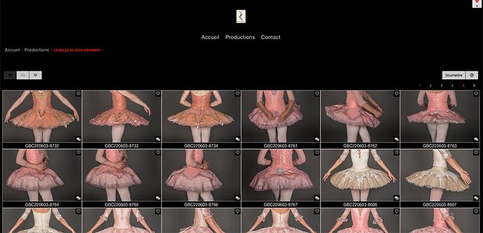
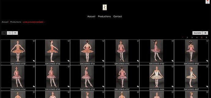
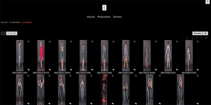
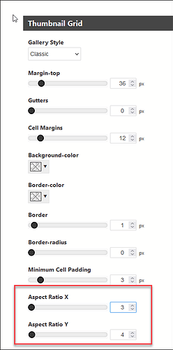
the “cover” setting means that the cell will be entirely filled with image. If the image isn’t the same aspect ratio as the cell, you get what you’re seeing now. If you want the thumbnails to appear larger, adjust the number of columns.
I’ve exhausted my ideas and can’t really tell any more from just looking at the front end.
Both the Inspector and the page source code show that the metadata-one and metadata-two list items are empty. To me, that means the images need to be republished (push metadata)
Still stumped by this thumbnail caption issue. In an almost identical web site I built, I checked to see any similarities between the two, trying to single out why the thumbnails have no caption.
On this page: https://pideja.ca/galleries/01_duceppe/2022-2023/01-mama/, the settings are set at
`Metadata Display/Metadata One/ON
Metadata One/Tokens/{Filename}
a look with the Inspector reveals that there is indeed information to be displayed:
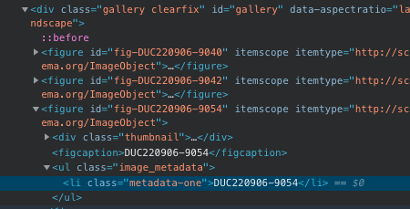
Moving to the site to be upgraded: https://pideja.ca/gbc/galleries/19_luna/
All the settings in Backlight are identical. But a look at the Inspector reveals no information available:
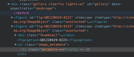
No CSS is involved, rather nothing addresses the figcaption metadata under the thumbnails on both sites.
So, the problem or error must be elsewhere since both sites have identical settings.
Still looking for that elusive mistake while wondering why the Okapi template settings are not simply carried over to the Pangolin template.
`
Okapi and Pangolin are different structures. That’s probably why settings don’t migrate, just like previous jumps from, for example, CE3 to CE4.
Are you republishing the metadata?
In the process of republishing the metadata. Seems to work. It’s a long process because on my box, I can’t republish more than one album less I get the dreaded C Stack overflow message.
Are you republishing just the metadata or the images as well?
Just the metadata, but there are over 1000 images to republish. Anyway, I’m done now and I do have the file names under the thumbnails!
Still looking to format correctly the thumbnails and place that red heart on the right side…
Did you try my earlier suggestion about the heart icon? It appears you’ve set text-align to center in the Top Pallet section of the template
Forgot about that…corrected the setting as suggested…bravo!
The problem is that I can’t format the thumbnails to be vertical or “portrait”. I can only get horizontal or landscape format. Since the images themselves are “portrait”, when I force coverage, I get a slice of the image, in the middle section. If I set forced coverage to never
I get the full image but since the thumbnail frame is landscape, the result is a small image within a somewhat large frame.
Why can’t the frame be “rotated”? Any combination of aspect ratio yields the same result.
Use the Classic layout and set the thumbnail cell size aspect ratio 1:1
or maybe try Justified
The album’s thumbnail grid is already set to CLASSIC. Changing the aspect ratio to any value whatsoever doesn’t change anything. I cleared the cache to no avail.
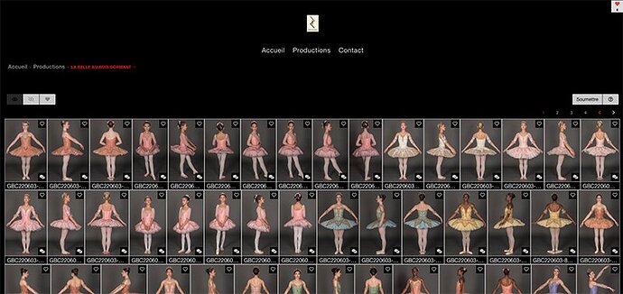
Going to JUSTIFY displays 20 thumbnail images per row and they are very small!
If I’m looking at the right album, it looks like you still have coverage being forced.
(can you post another album link so we can be sure we’re looking at the same thing?)
For the Justified layout, you need to adjust the Row Height setting to control the size of the displayed thumbnails.
This album is set at CLASSIC with 1:1 aspect ratio
https://pideja.ca/gbc/galleries/20_la-belle-au-bois-dormant/
And what’s the problem with this? Do you want larger thumbnails?
This album is set at JUSTIFIED with row height set at 200. Increasing the height number only stretches and distorts the image.
those don’t look distorted, compared to the classic, non-forced coverage version. Try increasing the row size to 400px, the same as the thumbnail renditions.
And for the Classic layout above with non-forced coverage, what’s the problem?
“…those don’t look distorted, compared to the classic, non-forced coverage version. Try increasing the row size to 400px, the same as the thumbnail renditions.”
You must mean the JUSTIFIED version. I tried changing the row height but all that did was stretch and distortion of the thumbnail image. What you see in the example previously sent is with the height set at 200. Here it is with the height set at 300…
As for the CLASSIC version, if I can’t get the thumbnail to have an aspect ratio of something like y=4, x=3 as I had them in the Okapi, I’d rather have them as they are. They have a more “modern” feel to them and the people at the Ballet won’t have a problem finding what they want. At least that’s what I’m counting on.
